Full-stack development requires more than just coding skills; it demands a clear understanding of how different parts of an application interact. One of the most effective tools for visualizing this interaction is the UML Activity Diagram. This guide explores how to use these diagrams to map out complex workflows, ensuring seamless communication between user interfaces and server-side logic.
🤔 Why Full-Stack Developers Need Activity Diagrams
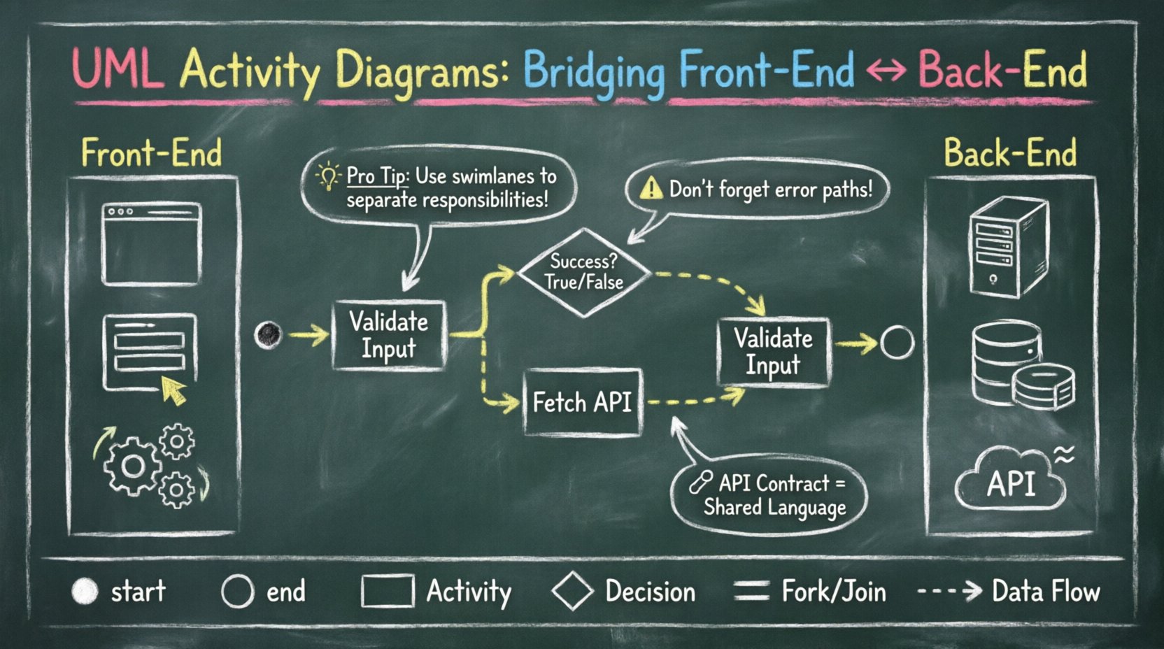
When building a web application, developers often work in silos. Front-end engineers focus on user experience, while back-end engineers handle data integrity and API performance. This separation can lead to misunderstandings about how data flows through the system. An activity diagram provides a shared visual language that clarifies:
- Process Flow: How a request moves from a button click to a database transaction.
- Decision Points: Where the system branches based on user input or validation results.
- Concurrency: How multiple tasks run simultaneously without blocking the interface.
- Error Handling: What happens when a step fails and how the system recovers.
By visualizing these elements, teams can identify bottlenecks early. Instead of debugging a broken feature after deployment, developers can trace the logic on paper or a digital canvas. This proactive approach reduces technical debt and improves overall system reliability.
🧩 Core Components of an Activity Diagram
To create effective diagrams, you must understand the standard symbols. These elements act as the vocabulary of your workflow visualization.
1. Start and End Nodes
- Start Node: Represented by a filled black circle. It marks the entry point of the process.
- End Node: Represented by a black circle with a border. It signifies the successful completion of the workflow.
2. Activity States
- Rectangular Boxes: These represent specific actions or operations. For example, "Validate User Input" or "Fetch API Data".
- Swimlanes: These divide the diagram into sections based on responsibility, such as Front-End, API Gateway, or Database.
3. Control Flow
- Arrows: Indicate the direction of flow between activities.
- Decision Nodes: Diamond shapes where the path splits based on a condition (e.g., If Login Successful).
- Join Nodes: Filled circles where multiple parallel flows converge.
4. Object Flows
- Dashed Lines: Show the movement of data objects between activities, distinct from the control flow.
🖥️ Front-End Logic in Activity Diagrams
The front-end layer is where the user interacts with the application. Activity diagrams here focus on state management and event handling.
Common Front-End Patterns
- Form Submission: Capture input, validate locally, send to API, and update the UI based on the response.
- Navigation: Handle route changes, loading states, and permission checks before rendering a new page.
- Real-Time Updates: Manage WebSocket connections for chat features or live notifications without refreshing the page.
Consider a user registration flow. The diagram should show the following steps:
- User enters email and password.
- System checks password strength.
- System checks if email exists.
- If checks pass, trigger API call.
- If checks fail, display error message.
- Upon success, redirect to dashboard.
Visualizing Asynchronous Tasks
Front-end applications often run asynchronous tasks. In an activity diagram, these are represented by fork nodes. This indicates that multiple operations can occur at the same time.
| Task | Dependency | Diagram Representation |
|---|---|---|
| Load Image | None | Fork Start |
| Validate Form | Input Received | Parallel Activity |
| Render UI | Both Complete | Join Node |
This structure helps developers ensure that the user interface does not freeze while heavy processing occurs in the background.
🖧 Back-End Logic in Activity Diagrams
The back-end layer handles data persistence, business rules, and external integrations. Diagrams here must be precise regarding transaction management and security.
API Request Lifecycle
A typical API request involves several distinct phases. Mapping these phases ensures that every layer of the stack is accounted for.
- Authentication: Verify the token or session ID.
- Authorization: Check if the user has permission to access the resource.
- Validation: Ensure incoming data matches the schema.
- Business Logic: Execute the core function (e.g., calculate total price).
- Persistence: Save changes to the database.
- Response: Return JSON data to the client.
Handling Database Transactions
When multiple database operations are required, atomicity is crucial. Activity diagrams can illustrate rollback scenarios clearly.
Scenario: Placing an Order
- Step 1: Check inventory stock.
- Step 2: Reserve stock.
- Step 3: Process payment.
- Step 4: Create order record.
- Decision: Did payment succeed?
- Yes: Confirm order.
- No: Rollback stock reservation.
By explicitly drawing the rollback path, developers avoid situations where stock is reserved but the order is never created.
🔗 Bridging Front-End and Back-End
The most critical part of a full-stack diagram is the connection point. This is where the client and server handshake occurs.
Defining the Contract
The API contract defines what the front-end expects and what the back-end provides. An activity diagram helps validate this contract before code is written.
- Request Payload: What fields are required?
- Response Codes: What HTTP status codes indicate success or failure?
- Error Messages: How is the error communicated to the user?
Visualizing the Handshake
Use swimlanes to separate concerns. One lane represents the Browser, and another represents the Server.
| Swimlane: Browser | Swimlane: Server |
|---|---|
| Submit Form | Receive Request |
| Wait for Response | Process Validation |
| Wait for Response | Query Database |
| Receive JSON | Return Status 200 |
| Update UI | Close Connection |
This visual separation makes it easy to spot where data might get lost or where latency might occur. For instance, if the "Wait for Response" block is too long, it indicates a need for optimization.
⚙️ Best Practices for Creating Diagrams
Creating a diagram is an art. Following these guidelines ensures your diagrams remain useful over time.
1. Maintain Granularity
Do not make the diagram too high-level or too detailed.
- Too High: "Process Order" is too vague. It doesn’t show validation or inventory checks.
- Too Low: "Increment Variable" is too detailed. It belongs in the code, not the design.
- Just Right: "Update Inventory Count" captures the logic without exposing implementation details.
2. Use Consistent Naming
Activity labels should be action-oriented. Use verbs like "Fetch", "Save", "Validate", or "Send". Avoid noun phrases like "Data Fetching". This makes the flow feel dynamic and logical.
3. Document Edge Cases
Happy paths are easy to draw. Unhappy paths are where bugs live.
- What happens if the database is down?
- What if the user cancels the operation mid-way?
- What if the network request times out?
Always include at least one failure branch for critical operations.
4. Keep it Updated
A diagram that does not match the code is worse than no diagram. When the code changes, the diagram must change. Treat the diagram as living documentation that evolves with the project.
🛠️ Implementation Without Specific Tools
You do not need specific software to create these diagrams. The goal is clarity, not aesthetics. However, certain features help maintain organization.
Hand-Drawn Sketching
- Great for brainstorming sessions.
- Encourages rapid iteration.
- Use a whiteboard or large paper.
Digital Whiteboards
- Allows for infinite canvas space.
- Supports collaboration between team members.
- Good for storing diagrams alongside code repositories.
Code-Based Diagramming
- Some teams prefer defining diagrams in text files.
- This keeps the diagrams version-controlled.
- Changes in the text file automatically update the visual representation.
🚫 Common Pitfalls to Avoid
Even experienced developers make mistakes when designing workflows. Be aware of these common traps.
1. Ignoring Concurrency
Assuming all tasks happen in a straight line. In reality, front-end applications often load images while fetching data. Use fork and join nodes to represent this parallelism.
2. Over-Complicating the Flow
Trying to show every single line of code in the diagram. This creates a spaghetti diagram that is impossible to read. Focus on the logic flow, not the syntax.
3. Missing Error States
Most diagrams show the successful path. If you do not draw the error path, you are likely to miss error handling during development.
4. Ambiguous Decision Nodes
Every diamond shape needs a clear label. "True" and "False" are better than "Yes" and "No" to avoid confusion about what is being decided.
🔄 Maintenance and Evolution
As the application grows, the activity diagrams must evolve. Regular reviews ensure that the visual documentation matches the reality of the codebase.
Code Reviews
Incorporate diagram updates into the pull request process. If a developer adds a new validation step, they should update the diagram as well.
Onboarding New Team Members
Use these diagrams to explain how the system works. A new developer can trace a request from the UI to the database in minutes, rather than weeks.
System Audits
During security audits, activity diagrams help identify where sensitive data is processed. This ensures compliance with regulations regarding data handling and encryption.
📝 Final Thoughts
UML Activity Diagrams are not just about drawing pictures. They are a thinking tool. They force you to slow down and consider how every part of your application connects. For full-stack developers, this clarity is essential. It bridges the gap between the user’s experience and the server’s logic, ensuring a robust and maintainable system.
By investing time in these diagrams, you save time later. You reduce bugs, improve communication, and create a clearer path for future development. Start small, focus on the critical flows, and let the diagrams guide your coding process.
Remember, the best diagram is the one that is actually used. Keep it simple, keep it updated, and keep it visible.