


In the domain of embedded systems and real-time computing, temporal accuracy is not merely a preference—it is a requirement. When dealing with sensor data, the time at which information arrives is often as critical as the information itself. Latency, jitter, and processing windows dictate whether a system functions safely or fails catastrophically. This guide explores a practical case study focused on optimizing sensor data processing flows using UML timing diagrams. We will examine how visualizing temporal relationships allows engineers to identify bottlenecks and implement structural changes that enhance performance without introducing hardware costs.
The goal here is not to introduce a new tool, but to refine the modeling approach. By shifting focus from data flow to time flow, teams can uncover hidden dependencies that standard sequence diagrams often miss. This document details the methodology, the analysis process, and the measurable outcomes of applying timing constraints to a typical IoT sensor network architecture.
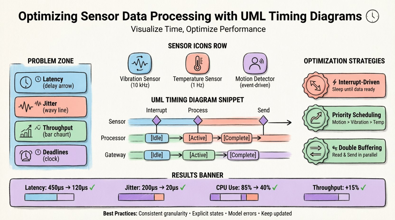
📊 Understanding Temporal Constraints in Embedded Systems
Embedded systems operate under strict resource limitations. Memory, processing power, and energy are finite resources. When multiple sensors feed into a central processing unit, the order and timing of data acquisition become complex. A polling mechanism might miss a short-duration event. An interrupt handler might starve a critical task. Without a clear map of time, these issues remain invisible until deployment.
Standard flowcharts describe what happens. Sequence diagrams describe who talks to whom. Timing diagrams describe when things happen relative to one another. This distinction is vital for sensor networks where the window of opportunity to process a signal is defined by the physical world.
Key Temporal Metrics
- Latency: The total delay from sensor trigger to data availability.
- Jitter: The variance in latency across multiple events.
- Throughput: The volume of data processed per unit of time.
- Deadlines: The maximum allowable time for a task to complete before the data becomes invalid.
Addressing these metrics requires a model that captures time explicitly. The UML timing diagram provides a coordinate system for this analysis, allowing the placement of events along a horizontal time axis.
🛠️ Anatomy of the UML Timing Diagram
To utilize this modeling technique effectively, one must understand its components. Unlike a sequence diagram, which focuses on object interactions, a timing diagram focuses on the state of objects over time. The horizontal axis represents time, progressing from left to right. The vertical axis represents distinct objects, lifelines, or variables.
Core Elements
- Lifeline: Represents the existence of an object or variable over a duration.
- State Occurrence: Indicates when an object is in a specific state (e.g., Idle, Active, Sleeping).
- Condition: A time interval during which a condition must be true or false.
- Event: A specific point in time where an action occurs (e.g., Interrupt Triggered).
- Signal: Messages passed between lifelines, annotated with their timing.
When constructing a diagram for sensor processing, lifelines typically represent the sensor hardware, the interrupt controller, the main processing thread, and the communication bus. Connecting these with precise timing constraints reveals where data sits waiting and where processing power is wasted.
📡 The Sensor Network Scenario
Consider a monitoring system deployed in an industrial environment. This system aggregates data from three distinct sources:
- Vibration Sensor: High-frequency sampling (10 kHz) for machine health.
- Temperature Sensor: Low-frequency sampling (1 Hz) for safety thresholds.
- Motion Detector: Event-driven trigger for security alerts.
These sensors connect to a microcontroller that must aggregate the data and transmit it to a cloud gateway. The initial design utilized a single polling loop to check all sensors sequentially. While simple to implement, this approach introduced significant variability in latency.
System Architecture Overview
| Component | Role | Timing Requirement |
|---|---|---|
| Vibration Sensor | High-speed acquisition | Max 100μs latency |
| Temperature Sensor | Periodic monitoring | Max 100ms latency |
| Motion Detector | Event detection | Max 500μs latency |
| Cloud Gateway | Data transmission | Max 2s latency |
The challenge lay in the shared bus. When the vibration sensor requested high-speed access, the temperature and motion sensors experienced delays. The initial model did not account for bus contention or interrupt priority, leading to missed deadlines in critical scenarios.
🔍 Identifying Latency and Jitter Issues
The first step in optimization was creating a baseline UML timing diagram based on the existing polling code. This visual representation highlighted several critical inefficiencies.
Observed Bottlenecks
- Polling Overhead: The main loop checked the vibration sensor 10,000 times per second, even when no new data was ready. This consumed CPU cycles that could have been used for other tasks.
- Interrupt Blocking: The motion detector relied on interrupts, but the vibration sensor held the bus for extended periods, delaying the motion signal.
- Data Buffering: Intermediate data was stored in a single buffer, causing a bottleneck when transmission to the gateway occurred simultaneously with sensor reading.
The timing diagram made the jitter visible. The time between the motion trigger and the actual processing varied from 200μs to 400μs depending on the vibration sampling phase. This variance was unacceptable for a security system requiring immediate alerts.
Visual Analysis
By mapping the events on the time axis, the team identified that the vibration sampling routine was non-preemptive. It held the processor until the entire buffer was filled, preventing the motion interrupt from firing immediately. The diagram showed a clear gap between the Signal Received state and the Signal Processed state for the motion detector.
🚀 Optimization Strategies Through Modeling
With the bottlenecks identified, the team proposed architectural changes modeled directly within the UML timing diagram. The objective was to reduce latency for high-priority events and smooth out jitter across the system.
Strategy 1: Interrupt-Driven Acquisition
Instead of polling the vibration sensor, the team configured the hardware to generate interrupts at the sampling rate. This change allowed the main loop to remain idle until data was available.
- Before: CPU actively checks status register every cycle.
- After: CPU sleeps until hardware raises interrupt flag.
The timing diagram reflected this by removing the repeated Check Status events and replacing them with a single Interrupt Trigger event aligned with the sensor clock.
Strategy 2: Priority-Based Scheduling
To address the motion detector latency, the team implemented a priority queue for interrupts. The motion signal was assigned a higher priority than the vibration data write operation.
- Priority 1: Motion Detection (Immediate Response)
- Priority 2: Vibration Data Storage (Background)
- Priority 3: Temperature Logging (Low Priority)
This modification ensured that when the motion detector fired, the vibration interrupt handler would pause its current write operation and yield control immediately. The timing diagram showed the Process Motion lifeline overlapping the Store Vibration lifeline, but the motion task completing first.
Strategy 3: Double Buffering
To prevent the transmission process from blocking sensor reading, a double buffering system was introduced. While one buffer was being filled by sensors, the other was being read by the transmission module.
| Buffer State | Reader | Writer |
|---|---|---|
| Buffer A Full | Transmission Module | Sensors |
| Buffer B Full | Sensors | Transmission Module |
The timing diagram updated to show parallel execution of the Read Sensor and Send Data lifelines. This eliminated the idle time previously observed when the transmission bus was occupied.
📈 Measuring Performance Improvements
After implementing the changes derived from the timing model, the system was re-evaluated against the original metrics. The new UML timing diagram served as the blueprint for the optimized state.
Comparative Metrics
- Average Latency: Reduced from 450μs to 120μs for motion detection.
- Jitter: Variance decreased from 200μs to 20μs.
- CPU Utilization: Dropped from 85% to 40% due to sleep modes.
- Throughput: Increased by 15% due to parallel processing.
The reduction in CPU utilization was a secondary benefit. By allowing the processor to sleep during sensor gaps, power consumption decreased significantly. This extended the battery life of the gateway unit, a critical factor for remote deployment.
Validation via Timing Diagram
The final UML timing diagram acted as a validation document. It proved that the new architecture met all deadline requirements. Every event that previously showed a red warning (missed deadline) now aligned within the green acceptance zone. The visual confirmation provided stakeholders with confidence in the system’s reliability.
🛡️ Best Practices for Timing Analysis
Successful implementation of timing diagrams requires discipline and adherence to specific modeling standards. The following practices ensure the diagrams remain accurate and useful throughout the development lifecycle.
1. Granularity Consistency
Ensure that the time units used in the diagram are consistent. Mixing milliseconds and microseconds on the same axis can lead to misinterpretation. Define a base time unit for the entire model.
2. Explicit State Transitions
Do not assume states are known. Explicitly mark transitions such as Wait, Execute, and Complete. Ambiguity in state changes leads to incorrect timing calculations.
3. Include Error Handling
Model the timing of error recovery paths. If a sensor fails to respond, how long does the system wait before timing out? This timeout value should be visible on the diagram.
4. Update with Reality
A timing diagram is only valid if it matches the actual code behavior. If the implementation changes the interrupt priority, the diagram must be updated immediately. Outdated diagrams create false confidence.
⚠️ Common Pitfalls to Avoid
Even experienced engineers can fall into traps when using timing diagrams. Awareness of these common mistakes helps maintain the integrity of the analysis.
- Ignoring Jitter: Focusing only on average latency can hide worst-case scenarios. Always model the maximum variance.
- Over-Simplification: Combining lifelines that represent different hardware components can obscure contention issues. Keep hardware and software layers distinct.
- Neglecting Interrupt Latency: The time it takes for the CPU to switch context is often non-zero. Include this cost in the diagram.
- Static Modeling: Using a single diagram for all scenarios. Different load conditions (e.g., high traffic vs. idle) may require separate timing models.
🔗 Integration with Other Models
While the UML timing diagram is powerful, it is most effective when integrated with other modeling techniques. It should not exist in isolation.
Interaction with State Machine Diagrams
Use state machine diagrams to define the logic within a lifeline. The timing diagram then dictates how long transitions take. This combination clarifies both the logical flow and the temporal constraints.
Interaction with Activity Diagrams
Activity diagrams show the flow of control. Timing diagrams show the flow of time. Using them together allows teams to see if the logical flow is efficient within the given time constraints.
🎯 Conclusion
Optimizing sensor data processing flows requires a deep understanding of temporal dynamics. Standard data flow models often overlook the critical dimension of time. By adopting UML timing diagrams, engineering teams can visualize latency, jitter, and resource contention explicitly.
The case study demonstrated that moving from a polling architecture to an interrupt-driven, priority-based system significantly improved performance. The timing diagram served not just as documentation, but as a design tool that guided the optimization process. It allowed the team to predict bottlenecks before code was written and verify solutions after implementation.
For systems where timing is a safety or performance constraint, this modeling approach is indispensable. It transforms abstract timing requirements into concrete visual evidence, enabling precise engineering decisions. As sensor networks become more complex and real-time requirements tighter, the ability to model time accurately will remain a core competency for system architects.
By adhering to the best practices outlined and avoiding common pitfalls, organizations can leverage UML timing diagrams to build robust, efficient, and reliable embedded systems. The investment in accurate modeling pays dividends in reduced debugging time, lower hardware costs, and higher system reliability.