Creating clear, effective UML activity diagrams is a critical skill for any analyst or developer. Yet, many professionals struggle with diagrams that appear cluttered, confusing, or outright unreadable. When stakeholders look at a complex workflow visualization, they should not have to guess the intent of the flow. They should see it immediately. This guide addresses the common pitfalls that lead to messy diagrams and provides actionable strategies to restore clarity and precision to your modeling efforts.
A well-structured diagram communicates logic, dependencies, and decision points without ambiguity. A messy one obscures these details, leading to misinterpretations and costly errors during implementation. By focusing on layout principles, semantic accuracy, and structural discipline, you can transform chaotic sketches into professional-grade documentation.
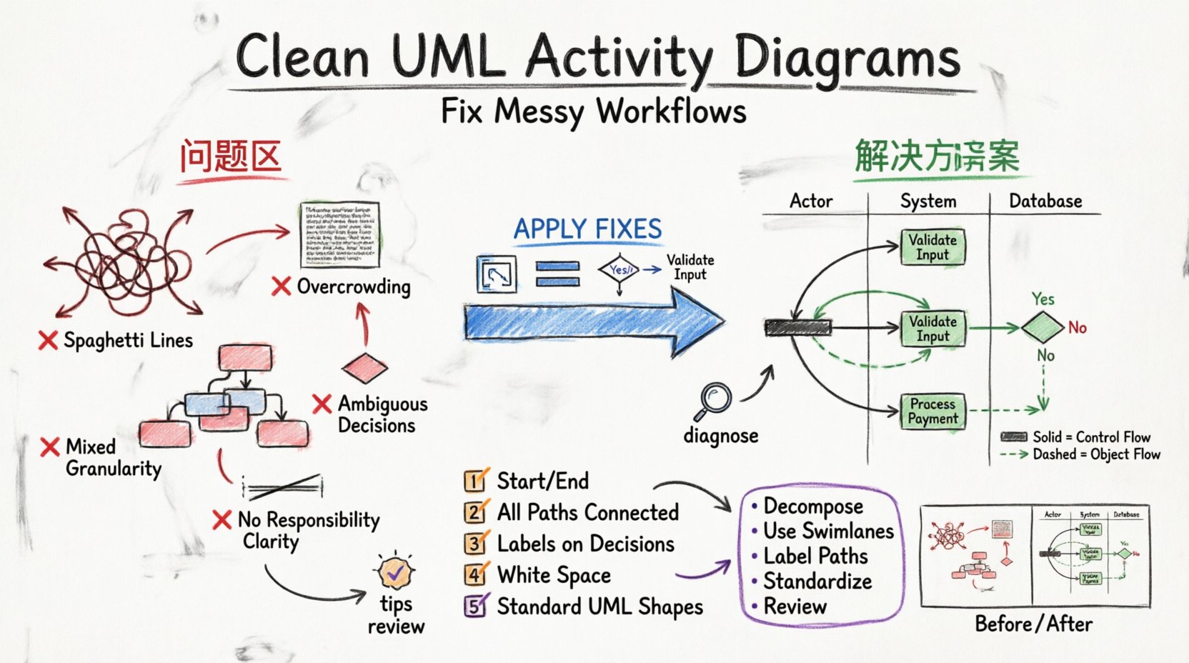
Understanding the Roots of Messy Diagrams 🧐
Before applying fixes, it is necessary to diagnose the source of the visual noise. Messiness rarely happens by accident; it usually stems from specific habits or missing guidelines. The following points outline the most frequent causes.
- Overcrowding: Trying to fit an entire system process onto a single page forces elements into tight spaces.
- Inconsistent Flow: Arrows crossing each other create a “spaghetti” effect that disrupts the reading path.
- Mixed Granularity: Mixing high-level business steps with low-level technical logic confuses the audience.
- Ignoring Swimlanes: Failing to separate responsibilities by actor or system layer makes ownership unclear.
- Poor Labeling: Vague action names like “Process Data” instead of “Validate User Input” add cognitive load.
When you recognize these patterns in your work, you can begin to apply structural corrections immediately.
Structural Issues That Break Clarity 🏗️
Structure dictates how information is processed. If the underlying architecture of the diagram is flawed, no amount of coloring or sizing will fix it. Here are the structural habits to avoid.
1. Lack of Decomposition
Attempting to model a complex business process in one go is a common mistake. A single activity diagram should not contain every step of a multi-day workflow. Instead, use hierarchical modeling. Create a high-level overview diagram and link it to detailed sub-diagrams for specific sections.
- Top-Level View: Show major phases (e.g., Order Receipt, Payment, Shipping).
- Sub-Level View: Drill down into one phase (e.g., Payment Validation) with specific decision nodes.
This approach keeps the main diagram clean and allows readers to focus on the level of detail they require.
2. Uncontrolled Fork and Join Points
Forking and joining control flows are essential for parallel processing, but they are often misused. Overusing parallel branches without clear synchronization points creates visual noise. Ensure that every fork has a corresponding join, unless the flow is explicitly independent.
- Check Synchronization: Do parallel paths converge logically?
- Limit Branches: Avoid more than three parallel branches in a single view if possible.
- Use Bar Symbols: Clearly mark the start and end of parallel sections with thick bars.
3. Missing or Ambiguous Decision Nodes
Decision nodes (diamonds) are where logic diverges. If a decision node has three or four paths without clear labels, the reader must mentally trace back to the start to understand the condition. Every outgoing path must be labeled with a boolean condition (e.g., “Yes”, “No”, “Valid”, “Invalid”).
Semantic Confusion: Symbols and Notation 📝
Even a perfectly laid-out diagram can fail if the symbols do not mean what they say. UML standards exist to ensure a universal understanding. Deviating from these standards creates confusion.
1. Stick to Standard Symbols
Do not invent new shapes. Use the standard circle for the initial node, the double circle for the final node, and rounded rectangles for actions. If you introduce a custom shape, you must provide a legend, which adds friction to the reading experience.
2. Object Flows vs. Control Flows
One of the most common sources of confusion is mixing object flows and control flows. A control flow represents the sequence of actions. An object flow represents the movement of data or artifacts between actions. Mixing these without clear distinction makes it hard to distinguish between “what happens” and “what moves”.
- Solid Lines: Typically indicate control flow (sequence).
- Dashed Lines: Often indicate object flow (data movement).
Ensure your legend or context clearly defines these line types if you deviate from standard conventions.
3. Consistent Action Naming
Names inside activity nodes should follow a verb-noun structure. This makes the diagram read like a sentence. Avoid noun phrases like “Payment”. Use “Process Payment”. This consistency improves readability significantly.
Layout Strategies for Clean Visuals 🎨
Once structure and semantics are correct, the visual layout becomes the final polish. These strategies help manage the physical space on the page.
1. Leverage Swimlanes Effectively
Swimlanes are the most powerful tool for organizing complex diagrams. They partition the diagram by responsibility. This allows you to see who is responsible for which step without reading every label.
- Vertical Swimlanes: Best for sequential processes where actors are listed top-to-bottom.
- Horizontal Swimlanes: Best for processes where roles are listed left-to-right.
When moving from one lane to another, use clear crossing points. Avoid having arrows cross multiple lanes unnecessarily.
2. Manage White Space
White space is not empty; it is a design element. Crowding nodes together forces the eye to work harder. Maintain consistent gaps between nodes. If a diagram exceeds the printable area, do not shrink the nodes. Split the diagram into multiple pages or sections.
3. Direction of Flow
Ensure the general flow of the diagram moves from top to bottom or left to right. Avoid 90-degree turns unless necessary for routing. Excessive back-and-forth movement creates a zigzag pattern that is difficult to follow.
Comparison of Common Errors and Fixes 📋
The following table summarizes common mistakes and their corrective actions. This serves as a quick reference during your review process.
| Issue | Visual Symptom | Correction Strategy |
|---|---|---|
| Spaghetti Lines | Arrows crossing each other randomly | Route lines around nodes or use orthogonal routing. |
| Overloaded Nodes | Text wrapping poorly or taking up too much space | Split the action into smaller sub-activities. |
| Missing Entry Points | Arrows pointing to nowhere | Connect all start points to the initial node. |
| Missing Exit Points | Dead ends in the flow | Ensure every path leads to a final node. |
| Inconsistent Symbols | Some diamonds are rotated, others are not | Apply a standard rotation (usually 45 degrees) to all decision nodes. |
| Crowded Swimlanes | Lanes are too thin for the content | Expand lane height or reduce the number of lanes. |
The Review Checklist for Diagram Hygiene ✅
Before finalizing any diagram, run it through this checklist. This ensures consistency and reduces the likelihood of errors.
- Start and End: Does the diagram have exactly one initial node and at least one final node?
- Connectivity: Are all nodes reachable from the start? Are all paths lead to a finish?
- Labels: Are all decision branches labeled with clear conditions?
- Readability: Can the text be read without rotating the page?
- Swimlane Logic: Do actions belong to the correct lane based on responsibility?
- Parallelism: Are forks and joins balanced and synchronized?
- White Space: Is there enough padding between elements to prevent visual crowding?
- Standard Compliance: Do the shapes match the standard UML activity notation?
Handling Complex Logic: Loops and Iterations 🔄
Loops are necessary for processes that repeat. However, they can clutter a diagram if not handled correctly. A large loop can make a diagram look like a maze.
1. Minimize Loop Size
If a loop involves many steps, consider breaking the loop into a separate sub-diagram. Represent the loop as a single activity node in the main diagram that references the detailed iteration process.
2. Use Guard Conditions
Ensure every loop has a clear exit condition. A loop without a clear exit condition implies an infinite process, which is rarely accurate in business logic. Label the exit path clearly (e.g., “Condition Met”, “Limit Reached”).
3. Avoid Nested Loops
Loops inside loops are visually difficult to track. If you have nested iterations, use a separate diagram for the inner loop. Keep the outer diagram focused on the high-level iteration.
Cognitive Load and Stakeholder Communication 🗣️
Diagrams are not just for developers; they are for business stakeholders, managers, and clients. These audiences have varying levels of technical expertise. A messy diagram alienates non-technical readers.
1. Audience Analysis
Ask who will be viewing the diagram. If it is for a business owner, focus on the business value and decision points. If it is for engineers, include the technical states and data flows. Do not try to satisfy both audiences in a single diagram.
2. Simplify Terminology
Avoid internal jargon. If the diagram is shared across departments, use terms that are understood by all. A developer might write “Execute API Call”, but a manager might prefer “Request External Service”. Choose the term that fits the audience.
3. Color and Contrast
While you should avoid CSS styling, you can use simple formatting to highlight key paths. For example, bolding the primary success path and using a lighter weight for exception paths can guide the eye. However, do not rely on color alone; use text labels to distinguish paths.
Iterative Refinement Process 🔄
Creating a clean diagram is rarely a one-step process. It requires iteration. The first draft is often the messiest because you are still discovering the logic. Treat diagramming as a drafting process.
1. Draft Freely First
Start by getting the logic down on the paper or canvas without worrying about alignment. Focus on the flow of information and decision points.
2. Refine the Structure
Once the logic is stable, apply swimlanes and group related activities. Move nodes to reduce line crossings.
3. Polish the Details
Finally, check labels, spacing, and consistency. Ensure all symbols are uniform. This is the stage where the diagram becomes professional.
Summary of Key Takeaways 🎯
Messy UML activity diagrams are usually the result of structural overload, inconsistent notation, or poor visual management. By addressing these root causes, you can produce diagrams that are accurate and easy to understand.
- Decompose: Break large processes into smaller, manageable diagrams.
- Use Swimlanes: Assign responsibilities clearly to avoid confusion.
- Label Paths: Ensure every decision branch has a clear condition.
- Standardize: Stick to standard UML shapes and naming conventions.
- Review: Use a checklist to validate connectivity and completeness.
Investing time in clarity pays off. A clean diagram reduces miscommunication, speeds up development, and ensures that the business logic is preserved accurately. By following these practices, your activity diagrams will become reliable assets for your projects.