Software architecture relies heavily on visualizing how components interact over time. While sequence diagrams are common, the UML Timing Diagram offers a distinct perspective focused on state changes and strict timing constraints. This guide addresses the most frequent questions encountered by developers learning to model real-time behavior and concurrency.
Whether you are designing embedded systems or debugging latency issues, understanding these diagrams helps clarify temporal relationships. Below are twenty detailed answers covering definitions, components, comparisons, and practical applications.
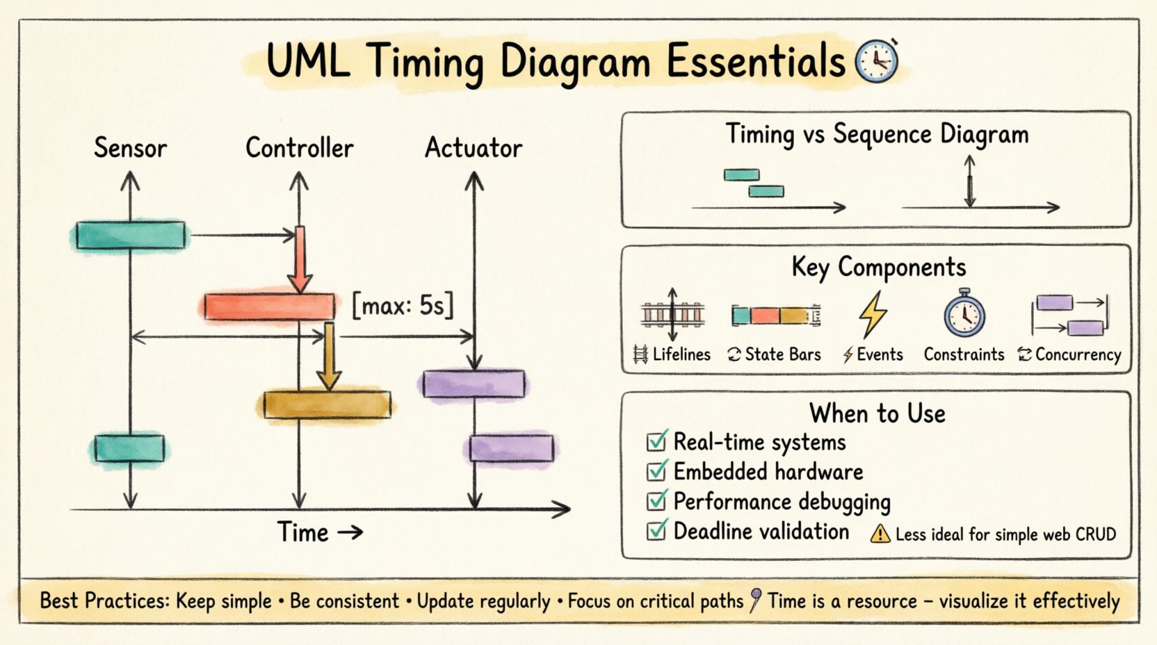
1. What is a UML Timing Diagram? ⏳
A UML Timing Diagram is an interaction diagram that focuses on the changes of state and values of features over time. Unlike sequence diagrams, which emphasize the order of messages between objects, timing diagrams prioritize the duration and timing of events. This makes them essential for systems where timing is critical, such as control systems or multimedia processing.
- Primary Focus: Time and state changes.
- Axis Orientation: Time flows horizontally.
- Use Case: Real-time system modeling.
2. How does the horizontal axis differ from a Sequence Diagram? 📏
In a sequence diagram, the horizontal axis represents the objects or participants involved. In a timing diagram, the horizontal axis represents time itself. This shift in perspective allows developers to see exactly how long a process takes, rather than just the order in which it happens.
- Sequence Diagram: Vertical axis = Time, Horizontal = Objects.
- Timing Diagram: Horizontal axis = Time, Vertical = Objects/Lifelines.
3. What are Lifelines in this context? 🛤️
Lifelines represent the objects or entities whose state is being monitored over time. They appear as vertical lines running through the diagram. Each lifeline tracks the state of a specific element during the time period specified.
- Lifelines are vertical in timing diagrams.
- They can be connected to other elements via state changes.
- They represent the lifespan of the object within the specific scenario.
4. How are State Changes Visualized? 🔄
State changes are shown as bars or blocks positioned along the lifeline. The length of the bar corresponds to the duration the object remains in that state. Different colors or shapes can denote different types of states, such as active, passive, or waiting.
- State Bars: Indicate duration of a specific state.
- Transitions: Occur at the boundary between bars.
- Values: Can be annotated to show numeric data changes.
5. What is the difference between a State and an Event? ⚡
An event is a point in time or an occurrence that triggers a change. A state is a condition or status that exists for a duration. In the diagram, events are often marked as vertical ticks or arrows, while states are horizontal bars.
- Event: Instantaneous trigger.
- State: Continuous condition over time.
6. How do you represent Time Constraints? ⏱️
Time constraints are often indicated by specific annotations or limits on the state bars. You can specify maximum or minimum durations for a state. This is crucial for validating that a system meets its performance requirements.
- Use annotations like
[max: 5s]. - Highlight violations with specific colors.
- Define absolute time values (e.g., 10:00:00) or relative offsets.
7. Can you show Concurrency in a Timing Diagram? 🔄
Yes. Concurrency is represented by multiple lifelines running parallel to each other. This indicates that different objects are active at the same time. It is useful for modeling multi-threaded applications or parallel processing tasks.
- Parallel lifelines imply simultaneous execution.
- Helps identify race conditions.
- Clarifies resource contention scenarios.
8. When should you use a Timing Diagram instead of a State Machine Diagram? 🤔
State Machine Diagrams focus on the logic of state transitions triggered by events. Timing Diagrams focus on the time duration of those states. If your primary concern is how long a process takes rather than the logic of the transition, use the Timing Diagram.
- State Machine: Logic and control flow.
- Timing Diagram: Duration and performance.
9. How do you represent Signals? 📡
Signals are asynchronous events that trigger state changes. They are drawn as horizontal lines crossing lifelines. Unlike method calls, signals do not wait for a response immediately, making them distinct from synchronous messages.
- Drawn as open arrows.
- Indicate asynchronous communication.
- Do not block the sender.
10. What does a Value Change Look Like? 📉
Value changes are depicted as steps or curves along the lifeline. They show how a specific property of the object changes over time. For example, a sensor reading increasing from 0 to 100.
- Can be linear or exponential.
- Annotated with the variable name.
- Helps track data integrity over time.
11. How does this compare to a Sequence Diagram? 🆚
| Feature | Timing Diagram | Sequence Diagram |
|---|---|---|
| Focus | Time and State | Message Order |
| Time Axis | Horizontal | Vertical |
| Best For | Real-time constraints | Interaction flow |
| Complexity | High on timing logic | High on object count |
12. Can you model Deadlines? ⏰
Yes. Deadlines are critical for safety-critical systems. You can annotate a state bar to indicate the latest time a task must complete. This helps in verifying system reliability under stress.
- Mark with specific time values.
- Use for critical path analysis.
- Highlight missed deadlines visually.
13. How do you handle Nested Lifelines? 📦
Nested liflines represent sub-objects or components within a larger system. They allow you to drill down into the timing of internal processes without losing the context of the parent object.
- Drawn inside the parent lifeline.
- Share the same time axis.
- Clarify hierarchical timing dependencies.
14. What is the Role of Activation Bars? 🔋
Activation bars (or execution occurrences) show when an object is actively performing an operation. In timing diagrams, these often overlap with state bars to indicate when a process is running.
- Indicates active processing.
- Helps calculate CPU load.
- Shows when an object is busy.
15. How do you model Interrupts? ⛔
Interrupts are abrupt state changes that occur regardless of the current flow. They are shown as vertical lines cutting across the active state bar, forcing a transition to a different state immediately.
- High priority events.
- Sudden state transitions.
- Often used in error handling.
16. Is this diagram suitable for Web Applications? 🌐
While possible, timing diagrams are less common for standard web applications. They are better suited for embedded systems, real-time operating systems, or hardware interfaces where precise timing matters.
- Use for backend performance bottlenecks.
- Use for hardware communication.
- Less useful for simple CRUD operations.
17. How do you Document Asynchronous Processes? ⏳
Asynchronous processes are modeled by allowing the sender lifeline to continue while the receiver processes the request. This shows that the sender does not wait for a response.
- Non-blocking communication.
- Parallel execution paths.
- Reduces system latency perception.
18. What Tools are Typically Used? 🛠️
Various modeling tools support this diagram type. When selecting a tool, ensure it supports time-axis visualization and state bar annotations. The specific software brand is less important than the capability to render time accurately.
- Look for time-axis scaling.
- Check for export options.
- Verify collaboration features.
19. How do you Debug Timing Issues? 🐛
Debugging involves comparing the actual system behavior against the diagram. If a state lasts longer than modeled, investigate the code or hardware delays. The diagram serves as the baseline for expected performance.
- Compare logs to state bars.
- Identify bottlenecks.
- Refine estimates based on data.
20. Why is Documentation Important Here? 📝
Documentation ensures that all stakeholders understand the temporal constraints of the system. It prevents assumptions about how fast a system should respond. Clear diagrams reduce ambiguity in requirements.
- Aligns development and testing teams.
- Validates performance requirements.
- Supports long-term maintenance.
Summary of Best Practices 📌
When creating these diagrams, keep the following principles in mind to ensure clarity and utility.
- Keep it Simple: Avoid overcrowding lifelines.
- Be Consistent: Use standard notation for states.
- Update Regularly: Ensure the diagram matches the code.
- Focus on Critical Paths: Highlight time-sensitive processes.
By mastering the nuances of timing diagrams, developers can build systems that are not only functionally correct but also performant and reliable. These visual tools bridge the gap between abstract logic and physical time constraints.
Remember that time is a resource. Visualizing its flow helps manage it effectively across complex architectures.