If you are reading this, you have likely stared at a timing diagram for hours, convinced the logic is sound, only to watch it fall apart during implementation. You are not alone. Timing diagrams are often the most misunderstood artifact in the Unified Modeling Language (UML) family. Unlike sequence diagrams, which focus on the order of events, timing diagrams focus on the state of objects and the duration of time. This distinction is where most early-career engineers stumble.
Many engineers treat timing diagrams as just “sequence diagrams with a clock.” This misconception leads to diagrams that are confusing, inaccurate, and ultimately useless for development. In this guide, we will dissect why your diagrams are failing and provide a concrete framework for creating precise, actionable timing specifications.
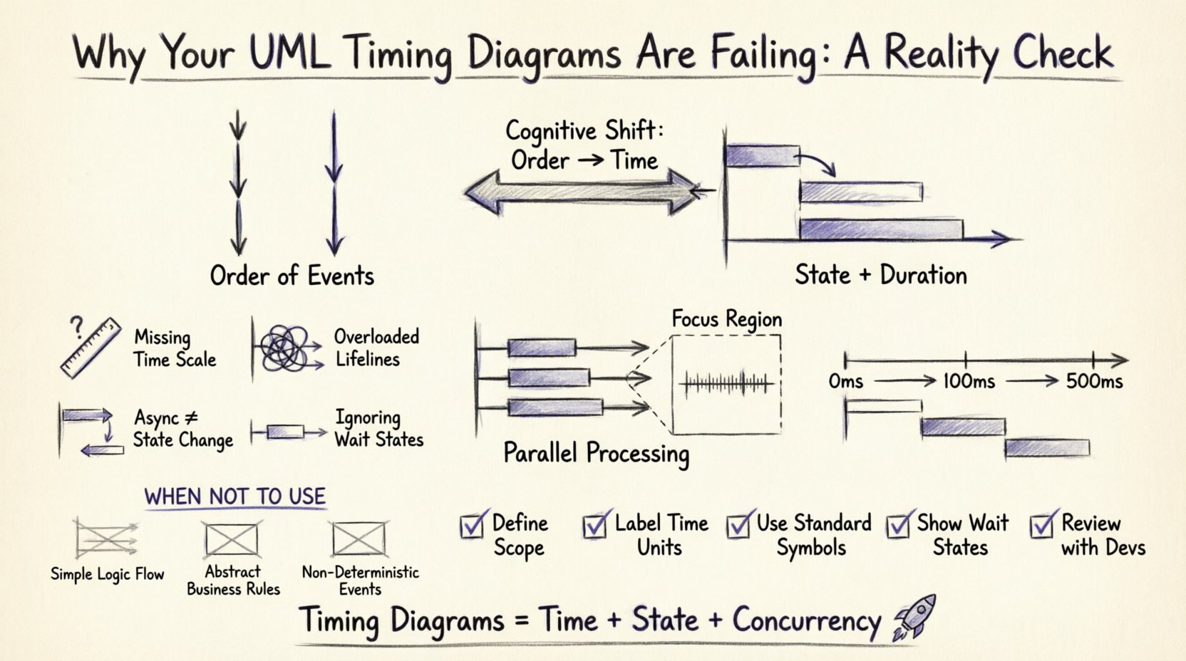
The Fundamental Misconception: Order vs. Time ⏳
Before drawing a single lifeline, you must understand the cognitive shift required. A sequence diagram answers “Who talks to whom and in what order?” A timing diagram answers “When does the state change, and how long does it take?”
When you try to cram sequence logic into a timing diagram, you create visual noise. The horizontal axis represents time, not just event sequence. This means:
- Proportionality Matters: If a task takes 500 milliseconds, it should visually occupy more space than a task taking 5 milliseconds. If you draw them as equal blocks, you lose the critical data about latency.
- Concurrency is King: Timing diagrams excel at showing parallel processes. If two operations happen simultaneously, their lifelines should overlap horizontally. Sequence diagrams often force a linear view that hides this reality.
- State is the Focus: The primary information carrier in a timing diagram is the state of the object, not the message passing itself.
Common Pitfalls That Break Your Diagrams 🛑
Let’s look at the specific errors that cause these diagrams to fail in real-world engineering contexts. These are not just syntax errors; they are modeling errors.
1. Ignoring the Time Axis Scale 📏
One of the most common mistakes is using a linear time axis without context. If your diagram shows a request being sent and a response coming back, but you don’t indicate the scale, the reader cannot judge feasibility.
The Fix: Always define the time scale. If the diagram represents a real-time system, label the axis in milliseconds or microseconds. If it represents a business process, label it in days or hours. Without a scale, the diagram is purely symbolic and loses its analytical power.
2. Overloading Lifelines with Too Much Activity 🔋
Early-career engineers often try to capture every single method call on a single lifeline. This creates a spaghetti mess of activation bars.
The Fix: Group activities. If Object A is processing data for 100ms, show a single activation bar spanning 100ms. Only break it down further if the internal state changes significantly. Use focus regions to zoom in on specific time windows if necessary.
3. Confusing Asynchronous Messages with State Changes 📥
When Object A sends an asynchronous message to Object B, Object A continues its work immediately. Object B begins work later. Engineers often draw the message as a solid line with an open arrow (synchronous) or fail to show the gap in time.
The Fix: Clearly distinguish between synchronous and asynchronous interactions. Asynchronous messages should show a gap between the send and the subsequent state change in the receiver. This gap represents the queue time or network latency.
4. Neglecting the “Wait” State ⏸️
Objects spend a lot of time waiting. In a sequence diagram, waiting is invisible. In a timing diagram, waiting is the most critical state.
The Fix: Explicitly draw the “idle” or “waiting” periods. If a thread is blocked on a semaphore, show that blockage on the timeline. This helps developers understand bottlenecks that don’t appear in standard sequence flows.
Structuring Concurrency Correctly ⚡
Concurrency is where timing diagrams shine, but it is also where they are most likely to be drawn incorrectly. You need to show multiple lifelines progressing simultaneously.
Parallel Processing vs. Sequential Execution
Consider a scenario where a user uploads a file. The system must:
- Scan the file for viruses.
- Resize the image thumbnail.
- Log the upload event.
These three tasks can happen in parallel. If you draw them sequentially, you overestimate the total time.
Visual Representation: Draw three lifelines. Ensure the activation bars for all three start at the same horizontal point. This visual alignment immediately communicates that the system is designed for parallelism.
Using Focus Regions for Complex Timing
When a specific interaction is highly time-sensitive, do not clutter the main diagram. Use a focus region (a box around a section of the diagram) to zoom in.
| Feature | Standard Lifeline | Focus Region |
|---|---|---|
| Purpose | High-level overview | Deep dive into specific window |
| Detail Level | Coarse-grained | Fine-grained (microseconds) |
| Complexity | Low | High |
| Use Case | Architecture review | Performance tuning |
By using focus regions, you maintain the integrity of the main diagram while providing the precision needed for debugging.
Handling Real-Time Constraints 🕒
In embedded systems or high-frequency trading, timing is not just a detail; it is a requirement. If you miss a deadline, the system fails.
Defining Deadlines and Periods
Do not rely on text annotations alone. Use the visual language of the timing diagram to represent constraints.
- Deadline Markers: Indicate when a response must be received. If the response arrives after this point, it is invalid.
- Periodicity: For recurring tasks (like a sensor read), show the repetition interval clearly.
Example Scenario: A temperature sensor reads every 500ms. The processor must read the value and update the display within 10ms. If you draw the reading process taking 20ms, the diagram immediately flags a design violation.
The “Hidden” Cost of Poor Timing Diagrams 📉
Why does this matter? Because bad diagrams lead to bad code.
1. Misunderstood Latency
If a developer sees a diagram where two processes happen sequentially, they might write code that blocks. If the diagram actually implies parallelism, the developer might implement a thread pool. The difference between blocking and non-blocking code is massive in terms of system throughput.
2. Race Conditions
Timing diagrams help visualize race conditions. If two threads access the same resource without proper synchronization, the diagram will show overlapping access bars. If you skip this step, the race condition only appears after testing, which is expensive.
3. Resource Contention
By mapping out exactly when resources are in use, you can identify when the CPU or memory will spike. This prevents “thundering herd” problems where too many processes wake up at the same time.
Best Practices for Creating Accurate Diagrams ✅
To move from “failing” to “effective,” follow this checklist before finalizing your diagram.
- Define the Scope: Are you modeling the entire system or a specific transaction? Don’t try to capture everything in one view.
- Establish a Baseline: Start with a known-good state. Show how the system transitions from idle to active.
- Use Consistent Symbols: Stick to standard notation for messages (solid vs. dashed lines) and states (rounded rectangles vs. sharp). Inconsistency confuses the reader.
- Label Time Units: Never leave the time axis unlabeled. “ms”, “s”, or “cycles” matters.
- Review with Developers: Don’t just show this to architects. Show it to the engineers who will implement it. They will spot impossible timings immediately.
When NOT to Use a Timing Diagram 🚫
Authority also means knowing when to stop. Timing diagrams are not a silver bullet. Using them where they don’t fit wastes time.
- Simple Logic Flows: If you just need to show “Login -> Check DB -> Show Page,” a sequence diagram is faster and clearer.
- Abstract Business Rules: Timing diagrams deal with concrete execution time. They are poor at showing business logic decisions like “If User is Premium, do X.”
- Non-Deterministic Events: If the timing depends on external factors you cannot control (like network jitter), a timing diagram might give a false sense of precision. Use it only for worst-case scenarios.
Debugging Your Existing Diagrams 🔍
Do you already have a diagram that feels wrong? Here is a step-by-step audit process to fix it.
- Check the Start Point: Does every lifeline start at the same logical time? If one starts later, explain why. Is it a delay or a separate thread?
- Trace the Activation Bars: Pick a bar. Does it make sense that the object is active for that duration? If it’s too long, is it doing too much? If it’s too short, is it missing work?
- Verify Message Crossing: Do messages cross the lifelines at the correct time? A message sent at T=10 should be received at T>=10. If it’s received at T=5, the diagram is physically impossible.
- Look for Gaps: Are there periods where an object is active but no messages are sent? This implies internal processing. Is that valid?
- Validate the End State: Does the diagram show how the system returns to idle? Or does it leave threads hanging?
Case Study: The Database Connection Pool 🗃️
Let’s apply this to a real-world scenario involving a connection pool. Imagine a web server handling requests.
Scenario: A request comes in. The server needs to fetch data from a database. The pool has 5 connections.
Poor Diagram: Shows the request waiting for the connection, then the query, then the response. It looks linear. It doesn’t show what happens if the pool is empty.
Correct Diagram:
- Lifeline 1: Request Handler (Sends request).
- Lifeline 2: Connection Pool (Checks availability).
- Lifeline 3: Database (Processes query).
If the pool is full, the Request Handler lifeline shows a “Wait” state for the duration of the timeout. This visualizes the bottleneck. If the pool has a spare, the Request Handler lifeline transitions immediately to “Query Sent”.
This distinction is crucial for capacity planning. The diagram tells you exactly how many concurrent requests the system can handle before the “Wait” state becomes the dominant state.
The Psychology of Reading Timing Diagrams 🧠
Even if you draw the diagram perfectly, it might fail if the reader can’t interpret it. Timing diagrams require a different cognitive load than sequence diagrams.
Horizontal Scanning: The reader must scan left-to-right while keeping track of multiple vertical tracks. This is harder than top-to-bottom scanning.
Visual Hierarchy: Use spacing to separate logical groups. If you have three parallel threads, space them evenly. If you have a main thread and a helper thread, make the main thread more prominent.
Color and Shape: While standard UML is black and white, using color (in modern tools) to indicate priority or criticality helps. Red for timeouts, green for success, yellow for warnings.
Summary of Critical Differences 📝
| Aspect | Sequence Diagram | Timing Diagram |
|---|---|---|
| Primary Axis | Event Order | Time Duration |
| Best For | Logic Flow | Performance & Latency |
| Concurrency | Implied | Explicit |
| State Changes | Focus on Interaction | Focus on Object State |
Final Thoughts on Technical Communication 🤝
UML is a tool for communication, not a document for compliance. If your timing diagrams are failing, it is often because they are trying to be too much like something else.
Embrace the unique nature of the timing diagram. Focus on time, state, and concurrency. Be precise with your scales. Don’t be afraid to leave things out if they don’t impact the timing logic. Your goal is to make the system’s behavior predictable for the engineer who reads it.
When you get these diagrams right, you reduce ambiguity. You prevent race conditions before they happen. You save weeks of debugging. That is the quiet confidence of a senior engineer. It is not about writing the most code; it is about defining the boundaries of time so clearly that the code writes itself.
Start auditing your current diagrams today. Apply the rules of scale, concurrency, and state. You will see the difference immediately. 🚀