
Mastering BPMN Visual Consistency: A Guide to Enterprise-Grade Modeling Standards
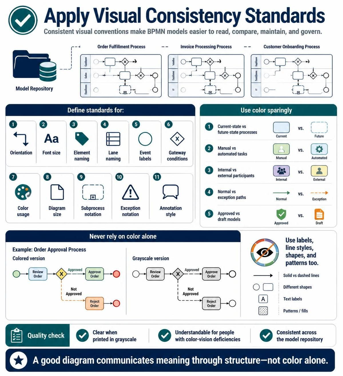
In the realm of Business Process Management (BPM), a diagram is not just a picture; it is a technical specification. If a blueprint for a building is inconsistent, the construction will fail. Similarly, if a BPMN (Business Process Model and Notation) diagram lacks visual consistency, the resulting software applications and process improvements will be plagued by ambiguity and maintenance issues.
This tutorial explores the critical concept of applying visual consistency standards across a model repository. We will break down how to define strict conventions for orientation, typography, and semantics to ensure your processes are readable, comparable, and governable.
The Importance of a Unified Model Repository
Imagine a folder containing dozens of diagrams representing different departments—Order Fulfillment, Invoice Processing, and Customer Onboarding. If each diagram was created by a different person using their own unique style, the repository becomes a chaotic library where every book has a different font and cover design.
To transform this into a professional asset, you must enforce a Model Repository standard. This involves defining a “rulebook” that dictates how every element looks, ensuring that:
- Readability is maximized: Stakeholders can scan a diagram and immediately understand the flow.
- Comparison is possible: You can easily compare a “Current State” vs. “Future State” if the visual language is identical.
- Maintenance is simplified: Updates follow a predictable pattern.
Defining the Standards: The 11 Pillars of Consistency
To achieve a unified look, you must define specific standards for the following 11 areas. These are not optional suggestions; they are the core configuration of your modeling environment.
1. Orientation and Font Size
Orientation: All diagrams should ideally flow from top-to-bottom or left-to-right. Randomly rotating tasks or lanes creates cognitive load for the reader. Ensure that your connector lines follow the natural reading direction.
Font Size: Establish a hierarchy. The diagram title should be largest, lane labels slightly smaller, and task names consistent. A common standard is 10pt-12pt for task labels and 8pt for internal attributes.
2. Naming Conventions
Consistency in naming is vital for searchability and automation. You must standardize:
- Element Naming: Should tasks be named “Verb + Noun” (e.g., “Approve Invoice”) or “Noun + Verb” (e.g., “Invoice Approval”)? Pick one and stick to it.
- Lane Naming: Lane names (Pools/Partitions) should represent organizational roles (e.g., “Finance Dept”) or system names (e.g., “ERP System”) consistently across all diagrams.
3. Visual Semantics: Events, Gateways, and Notation
The visual representation of logic must be uniform:
- Event Labels: Should start times be labeled “Start,” “Begin,” or “Initial”? Standardize to one term.
- Gateway Conditions: For Exclusive Gateways (the diamond with an X), define the syntax for labels. Should they be “Yes/No”, “Y/N”, or specific boolean expressions like “Is Valid = true”? Do not mix styles.
- Subprocess Notation: Define whether subprocesses will be collapsed (a simple box with a plus sign) or expanded (showing internal tasks) by default.
- Exception Notation: How do you visually represent an error? Use a specific icon, a dashed border, or a distinct color? This must be defined in the style guide.
The Role of Color: Use Sparingly
Color is a powerful tool for differentiation, but it is also a crutch. The golden rule of visual consistency is: Use color sparingly.
When used correctly, color conveys specific semantic meanings. Your standards should define exactly what color means what. Common conventions include:
- Current-State vs. Future-State: Use one color (e.g., Blue) for existing processes and a contrasting color (e.g., Green) for proposed changes.
- Manual vs. Automated: Use a specific shade for tasks performed by humans (e.g., a soft beige) and a different shade for system tasks (e.g., a dark grey or blue).
- Internal vs. External: Distinguish between activities performed by your organization (Internal) and those performed by third parties or customers (External).
- Normal vs. Exception Paths: Use standard solid lines for the happy path and a distinct color (like orange or red) for exception paths.
- Approved vs. Draft: Use a specific border color or background tint to indicate the lifecycle status of the diagram.
Accessibility and Grayscale Compatibility
A critical requirement of modern BPMN standards is accessibility. Color should never be the only way to communicate meaning.
Consider a scenario where a stakeholder prints your diagram in black and white, or a user views it on a low-quality monitor. If your “Exception Path” is only red, and the printer outputs it as grey, the distinction is lost.
To ensure your diagrams remain understandable in grayscale or for those with color-vision deficiencies, always pair color with:
- Line Styles: Use solid lines for normal flows and dashed lines for exceptions.
- Shapes: Use specific icons (like a warning triangle) alongside text labels.
- Patterns: Use hatching or shading patterns to distinguish background areas.
- Text Labels: Never rely on a color legend alone; label the flow explicitly.
Recommended Tooling: Visual Paradigm BPMN Tool
To implement these complex standards effectively, you need a tool that supports strict style enforcement. Relying on “freehand” drawing leads to inconsistency.
The recommended tool for this architecture is Visual Paradigm. Visual Paradigm is an industry-leading modeling platform that allows you to define and enforce global styles across your entire model repository.
Why Visual Paradigm is the right choice:
- Style Manager: It provides a centralized “Style Manager” where you can define the default font, line thickness, connector styles, and background colors for the entire project.
- Standard Compliance: It natively supports BPMN 2.0, ensuring that your gateways, events, and subprocesses adhere to the official standard.
- Repository Management: It handles the “Model Repository” concept efficiently, allowing you to link diagrams together while maintaining a unified look and feel.
- Accessibility: It allows for the definition of specific line styles (dashed, dotted) that work perfectly with color coding, ensuring your diagrams pass accessibility checks.
Conclusion
Building a high-quality BPMN ecosystem is not just about mapping processes; it is about engineering clarity. By applying rigorous visual consistency standards—defining your orientation, font, naming, and color usage—you transform a collection of diagrams into a cohesive, governable asset.
Remember the core principle: A good diagram communicates meaning through structure, not color alone. Always ensure that your diagrams are intelligible in grayscale and accessible to all users. By leveraging the Visual Paradigm BPMN Tool to enforce these standards, you ensure that your organization’s process intelligence is clear, professional, and ready for execution.