UML Activity Diagrams serve as the backbone for visualizing the dynamic behavior of a system. They map out the flow of control from one activity to another, offering a clear view of processes, workflows, and algorithms. However, creating a diagram that accurately reflects complex logic is a nuanced task. Many practitioners fall into traps that obscure the very information the diagram is meant to convey. When an activity diagram is flawed, it leads to miscommunication between developers, stakeholders, and testers. This guide identifies ten frequent errors and provides the structural corrections needed to ensure clarity and precision.
The goal of any activity diagram is to reduce ambiguity. A well-crafted diagram allows a reader to trace a path from start to finish without guessing the underlying logic. Conversely, a diagram riddled with mistakes can cause significant delays during the implementation phase. By understanding these common pitfalls, you can ensure your models are robust, maintainable, and easy to interpret.
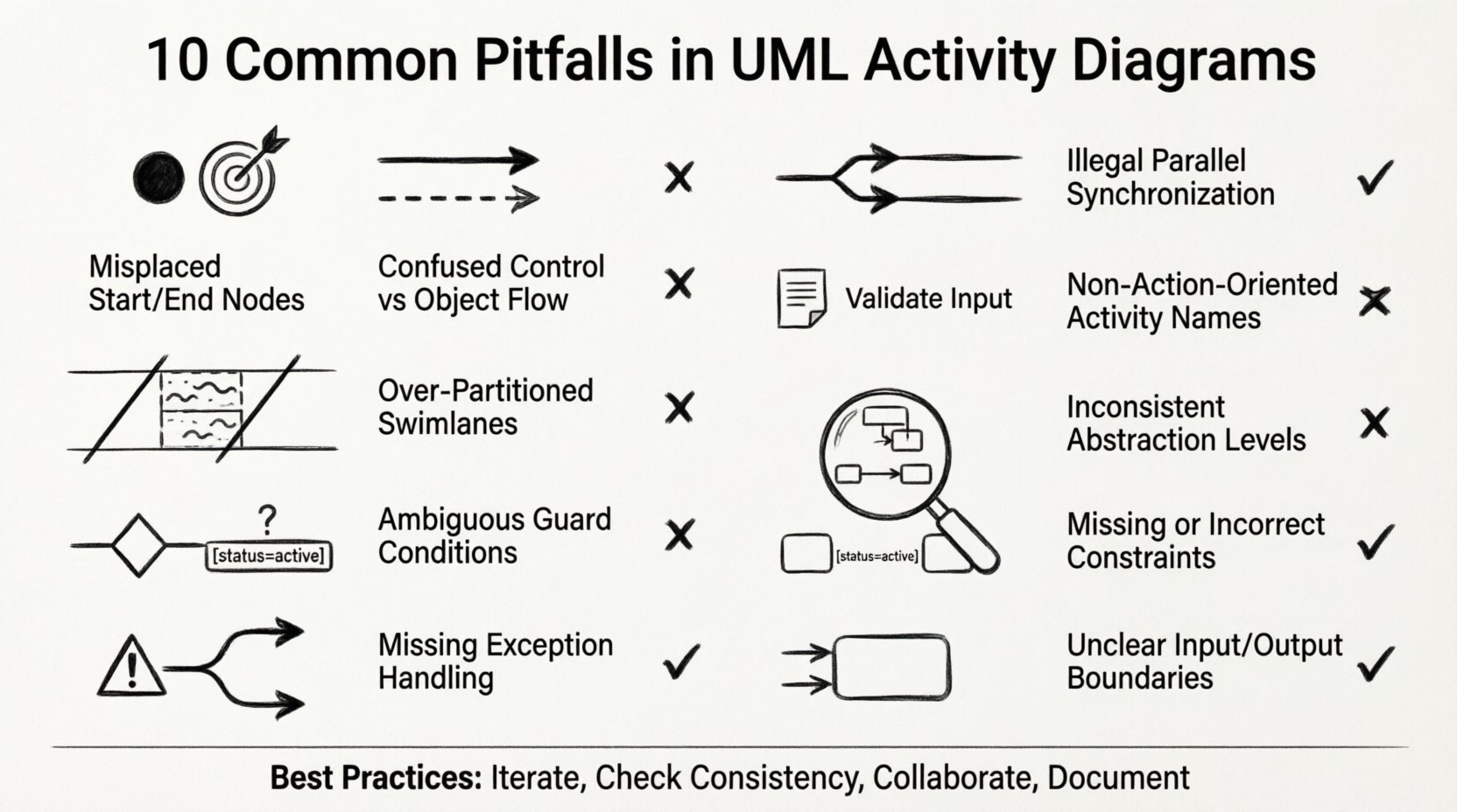
1. Ignoring Initial and Final Nodes 🔴
The most fundamental error is failing to define the start and end points of a process. Every activity diagram must have exactly one initial node and at least one final node. Without these anchors, the flow of control becomes undefined.
- The Consequence: If a reader cannot identify where the process begins, they may assume it starts at an arbitrary point. If there is no clear end, it implies the system never terminates, which is rarely true in reality.
- The Impact: Developers might implement loop structures incorrectly or fail to handle system shutdowns properly.
- The Fix: Always place a solid black circle at the beginning to represent the initial node. Place a bullseye symbol (black circle within a larger circle) for the final node.
Even in complex scenarios with multiple entry points, the diagram should logically funnel back to a single termination state or clearly indicate multiple distinct termination states. Never leave the flow hanging in the middle of the page.
2. Confusing Control Flow with Object Flow 🔄
UML distinguishes between the flow of control (logic) and the flow of data (objects). Mixing these two types of arrows is a source of significant confusion.
- Control Flow: Represented by a solid line with a thin arrowhead. It indicates that the activity at the end of the line is triggered after the activity at the start completes.
- Object Flow: Represented by a dashed line with a thin arrowhead. It indicates that data or objects are passed between activities.
When these are swapped, the diagram loses its semantic meaning. A control arrow implies a sequence of events, while an object arrow implies the movement of resources. If you draw a control arrow where an object should move, you suggest a logical dependency that does not exist. If you draw an object arrow where a trigger is needed, you imply data transfer where none occurs.
To avoid this, strictly adhere to the standard notation. Use solid lines for sequence and dashed lines for data movement. This distinction is critical for understanding the operational logic versus the data architecture.
3. Overcomplicating with Too Many Swimlanes 🏊
Swimlanes (partitions) are used to assign activities to specific actors, departments, or system components. While useful, they are often overused.
- The Problem: Adding a swimlane for every minor component creates a cluttered, wide diagram that is difficult to view on a single screen or page.
- The Consequence: Users may get lost navigating the horizontal space. The relationship between activities becomes obscured by the sheer number of lanes.
- The Fix: Limit swimlanes to the primary actors or major system modules. If a process involves too many participants, consider breaking it down into sub-activity diagrams linked by specific entry points.
Grouping related activities together is better than creating a new lane for every single step. A clean, compact diagram is more effective than a sprawling one that requires constant scrolling.
4. Neglecting Guards and Conditions ❓
Decision nodes in activity diagrams require guards to define the path taken. A decision node without a guard is a logical void.
- The Mistake: Leaving a decision node without labels on the outgoing edges implies that the path is random or determined by external factors not shown in the model.
- The Risk: This leads to incomplete logic coverage. If the system reaches a decision point, it must know exactly what condition triggers which path.
- The Correction: Every edge exiting a decision node must have a boolean expression or condition (e.g., [User Logged In], [Balance > 0]). Ensure all possible outcomes are covered to avoid deadlocks.
A missing guard condition is a silent bug in the design phase that manifests as an error in the runtime environment. Always verify that the sum of conditions at a decision node covers all logical possibilities.
5. Missing Exception Handlers (Exception Flows) ⚠️
Standard activity diagrams often focus on the “happy path”—the ideal scenario where everything goes right. However, production systems must handle errors.
- The Oversight: Failing to model what happens when an activity throws an exception or fails.
- The Impact: The resulting system may crash or hang when unexpected errors occur. The diagram implies success where failure is possible.
- The Solution: Include exception flows. These can be modeled using specific exception activities or by drawing edges labeled with exception conditions (e.g., [Error: Timeout]).
Robust modeling requires planning for failure. If a database connection fails, the system should retry or alert an administrator. These paths must be visible in the diagram to ensure the implementation team accounts for them.
6. Ambiguous Parallelism (Fork/Join) 🤝
Fork and Join nodes are used to represent concurrent activities. Misusing these can create synchronization issues.
- The Fork: Splits one flow into multiple concurrent flows. All outgoing edges are triggered simultaneously.
- The Join: Merges multiple concurrent flows. The activity at the join node only starts when all incoming flows have completed.
- The Mistake: Using a simple merge (decision node) instead of a Join node, or failing to match every Fork with a corresponding Join.
- The Result: This can lead to race conditions where a downstream activity starts before upstream dependencies are finished. Alternatively, it can cause a deadlock if a Join waits for a path that will never complete.
Ensure that every fork has a matching join. If activities run in parallel, they must converge at a specific synchronization point before proceeding to the next stage. Visual clarity is key here; ensure the lines crossing the join node are clearly distinct.
7. Poor Naming Conventions 🏷️
Labels on activities and edges are the primary source of information. Vague or inconsistent naming destroys the value of the diagram.
- The Issue: Using generic terms like “Process,” “Do Something,” or “Check.” These provide no insight into the actual operation.
- The Standard: Use verb-noun phrases for activities (e.g., “Validate User Input,” “Generate Report”). Use clear, concise labels for edges (e.g., [Valid], [Invalid]).
- The Benefit: Precise naming allows the diagram to serve as documentation. A developer reading the diagram should understand the logic without needing to ask a colleague.
Inconsistency is also detrimental. If one activity is labeled in the present tense and another in the past, it creates cognitive dissonance. Stick to a single tense and style throughout the entire model.
8. Inconsistent Granularity 📏
Granularity refers to the level of detail within an activity. Mixing high-level summaries with detailed steps in the same diagram causes confusion.
- The Scenario: One activity might be “Process Order” (a high-level summary), while a neighboring activity is “Click Button A” (a low-level detail).
- The Problem: This makes it hard to determine the scope of the system. The “Process Order” node implies a sub-process, but if the details aren’t shown, the reader doesn’t know what is included.
- The Approach: Maintain consistent levels of detail. If “Process Order” is a node, it should ideally be expanded in a separate sub-diagram. The current diagram should either show the high-level steps or the detailed steps, but not both mixed together.
A diagram with mixed granularity forces the reader to constantly switch mental contexts. This breaks the flow of understanding and reduces the diagram’s utility as a reference.
9. Skipping Object Constraints 📦
Activities often manipulate objects that must meet certain criteria. Ignoring these constraints leads to invalid state modeling.
- The Detail: An activity might require an object to be in a specific state before it can proceed.
- The Error: Drawing a flow without noting the preconditions on the objects involved.
- The Fix: Use object nodes to show where data is created or consumed. Attach constraints (e.g., [status = active]) to the activities or edges to clarify requirements.
Without object constraints, the diagram suggests that any object can enter the process. In reality, data integrity often depends on specific states. Modeling these constraints ensures the logic reflects the data requirements.
10. Forgetting Inbound/Outbound Object Flows 📥📤
Activities consume inputs and produce outputs. Failing to show these flows disconnects the diagram from the data model.
- The Mistake: Showing only control flow (logic) without showing what data moves between steps.
- The Consequence: The implementation team may not know what variables to pass between functions or modules.
- The Correction: Clearly identify object nodes that feed into activities and those that emerge from them. This creates a complete picture of both control and data.
When an activity modifies an object, the output object node should reflect the new state. This visibility helps in designing the underlying data structures and ensuring data consistency across the workflow.
Summary of Common Errors
| Mistake | Primary Impact | Recommended Correction |
|---|---|---|
| Missing Start/End Nodes | Undefined process boundaries | Add initial and final nodes |
| Control vs Object Flow Confusion | Logic and data misinterpretation | Use solid for control, dashed for data |
| Too Many Swimlanes | Visual clutter and cognitive overload | Limit lanes to major actors |
| No Guards on Decisions | Ambiguous branching logic | Label all outgoing edges |
| No Exception Handling | Unprepared for system failures | Include error paths |
| Fork/Join Mismatches | Race conditions or deadlocks | Match every fork with a join |
| Poor Naming | Ambiguity and misunderstanding | Use verb-noun phrases |
| Inconsistent Granularity | Scope confusion | Standardize detail levels |
| Skipping Object Constraints | Invalid state transitions | Add data preconditions |
| Missing Object Flows | Disconnected data model | Show inputs and outputs |
Best Practices for Clean Modeling
Avoiding mistakes is only half the battle. Adopting a disciplined approach to modeling ensures long-term maintainability.
- Iterative Refinement: Do not expect the first draft to be perfect. Create a rough sketch, identify gaps, and refine the details.
- Consistency Checks: Regularly review diagrams against the established standards. Are all nodes labeled? Are all flows connected?
- Collaboration: Have peers review the diagrams. A fresh set of eyes often spots missing exception paths or confusing labels.
- Documentation: Ensure the diagram accompanies a glossary of terms. This helps stakeholders understand the specific meaning of the labels used.
By rigorously applying these standards, you transform activity diagrams from simple sketches into powerful engineering assets. They become reliable references that guide development and testing phases without requiring constant interpretation.
Conclusion on Diagram Integrity
The quality of a system is often a reflection of the quality of its models. A flawed activity diagram introduces uncertainty into the development process. By addressing the ten common pitfalls outlined above, you ensure that the logic is explicit, the data flow is clear, and the boundaries are defined. This attention to detail saves time during implementation and reduces the risk of critical errors in the final product. Focus on clarity, consistency, and completeness to produce diagrams that truly serve the needs of the project and the team.
Remember that these diagrams are living documents. As requirements evolve, the diagrams must be updated to reflect the current state of the system. Keeping them accurate ensures they remain a valuable resource throughout the lifecycle of the software.