


In the modern digital landscape, organizations face an unprecedented level of complexity. Systems interconnect, data flows across borders, and business strategies pivot rapidly. Within this environment, Enterprise Architecture (EA) serves as the blueprint for alignment. However, a blueprint that exists only in text or dense documentation fails its primary purpose. To truly drive value, architecture must be seen. Visualizing enterprise architecture transforms abstract concepts into tangible assets that stakeholders can understand and use. This guide explores how effective visualization supports strategic decision-making without relying on hype or specific tooling.
The Challenge of Complexity in Enterprise Architecture 🌪️
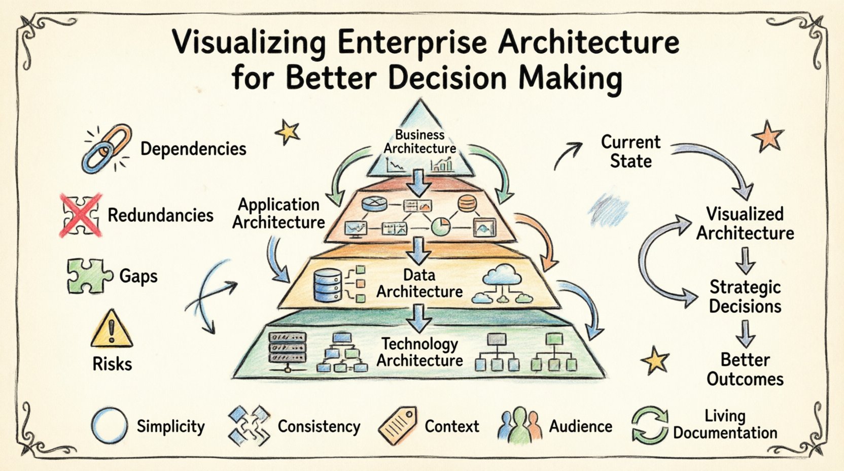
Enterprise architecture involves mapping the relationships between business strategy, processes, information, applications, and technology infrastructure. When an organization grows, these connections become intricate. A change in one application might impact a business process, which in turn affects data governance and regulatory compliance.
Without visualization, this web of relationships remains hidden. Decision-makers often struggle to see the full scope of their digital investments. They may approve new software based on immediate needs without understanding the long-term ripple effects on the existing landscape. This lack of clarity leads to redundancy, technical debt, and fragmented systems.
Visualizing the architecture brings the hidden connections to the surface. It allows leaders to see:
- Dependencies: How systems rely on one another.
- Redundancies: Where multiple teams are building the same capability.
- Gaps: Areas where business needs are not met by current technology.
- Risks: Single points of failure or outdated components.
By making these elements visible, the architecture team moves from being an administrative function to a strategic partner. The goal is not just to document, but to illuminate the path forward.
Why Visuals Drive Strategic Clarity 👁️
Human brains process visual information significantly faster than text. A diagram can convey the state of a complex system in seconds, whereas reading a ten-page report takes minutes or hours. In high-pressure decision environments, speed and clarity are paramount.
Bridging the Gap Between Business and IT
One of the biggest hurdles in architecture is communication. Business leaders speak the language of value, risk, and growth. IT leaders speak the language of infrastructure, APIs, and protocols. Visualizations act as a translation layer.
When a business capability map is overlaid with application support, a non-technical executive can see which business functions are supported by which technologies. This shared view fosters collaboration. It allows both sides to ask better questions:
- Business: “If we expand into this new market, what systems need to change?”
- IT: “If we upgrade this server, how does it affect the reporting dashboard?”
Reducing Cognitive Load
Complexity creates cognitive load. When stakeholders are overwhelmed by information, they tend to make conservative decisions or defer action. Clear visualizations reduce this load by organizing information into logical groups.
Using consistent icons, colors, and layout patterns helps users scan the information quickly. They can identify anomalies or trends without needing to memorize every detail. This efficiency leads to faster consensus and more agile governance.
Key Layers to Visualize 🧱
A comprehensive visualization strategy covers multiple layers of the enterprise. Each layer serves a different audience and answers specific questions. Focusing on just one layer often leads to incomplete insights.
Below is a breakdown of the essential layers and what each should communicate.
| Layer | Focus | Key Question Answered |
|---|---|---|
| Business Architecture | Strategy, Capabilities, Value Streams | How do we create value for our customers? |
| Application Architecture | Systems, Services, Interactions | Which applications support our capabilities? |
| Data Architecture | Information, Assets, Governance | Where is our data and is it reliable? |
| Technology Architecture | Infrastructure, Hardware, Networks | What supports our applications technically? |
1. Business Architecture
This layer is the foundation. It maps out the organization’s capabilities and how they flow into value streams. A capability map shows what the business does, not how it is done. This abstraction allows the architecture to remain stable even when specific technologies change.
Visualizing this layer helps identify:
- Overlapping capabilities between departments.
- Capabilities that lack sufficient investment.
- Opportunities for automation or outsourcing.
2. Application Architecture
Applications are the tools the business uses to execute its strategy. Visualizing the application landscape involves showing interactions between systems. This includes data flows, API connections, and integration points.
Key visual elements here include:
- Application portfolios (Crown Jewels vs. Commodities).
- Integration topology (Hub-and-spoke vs. Mesh).
- Technology stack compatibility.
3. Data Architecture
Data is the lifeblood of modern enterprises. A data architecture diagram shows how information moves from creation to consumption. It highlights data ownership, storage locations, and quality standards.
Effective visualization here addresses:
- Data silos that prevent cross-functional insights.
- Security boundaries for sensitive information.
- Latency issues in critical data pipelines.
4. Technology Architecture
The final layer represents the physical or cloud infrastructure. This includes servers, networks, and cloud services. While business leaders care less about this layer, IT operations and security teams rely heavily on it.
Visuals should focus on:
- High availability and redundancy.
- Network segmentation.
- Resource utilization trends.
Connecting Visuals to Business Decisions 🤝
Creating diagrams is only the first step. The true value lies in how these visuals influence decisions. Architecture is not a static artifact; it is a dynamic tool for governance and planning.
Scenario Planning
Leaders often need to assess the impact of potential changes. Visualization enables “what-if” scenarios. For example, if the organization decides to merge two divisions, the architecture team can model the combined landscape.
By overlaying the current state with the target state, stakeholders can see:
- Which systems will be decommissioned.
- Which integrations will break.
- The timeline and cost implications of the transition.
Investment Prioritization
Budget is always finite. Visualizations help justify where to spend resources. A heat map showing system criticality against technical debt can guide investment decisions.
For instance, if a system is marked as critical but also shows high maintenance costs and low reliability, the decision becomes clear: invest in modernization or replace it. Without this visual evidence, such decisions are often based on anecdotal evidence or political influence.
Risk Management
Risk is a core component of decision-making. Visualizing architecture allows for the identification of technical risks before they become incidents. Dependencies are the primary source of risk in complex systems.
Visual cues can highlight:
- Systems with no documented owners.
- Interfaces that have not been tested recently.
- Components relying on end-of-life software.
This proactive approach shifts the organization from reacting to failures to preventing them.
Principles of Effective EA Diagramming 📐
To ensure the visuals are useful, they must adhere to specific principles. A beautiful diagram that is confusing is worse than a simple one that is clear. The following principles ensure the architecture communicates effectively.
- Simplicity over Completeness: Do not try to show every single detail. Focus on the relationships relevant to the current decision. A map of a whole continent is less useful than a map of a specific city for a driver.
- Consistency: Use standard notation and symbols. If a circle always represents a database, never use it to represent a user. Consistency reduces the learning curve for viewers.
- Context: Every diagram should have a title, a date, and a scope. A diagram without context can be misinterpreted months later.
- Audience Alignment: Tailor the view to the viewer. Executives need high-level capability maps. Engineers need detailed interface specifications. One size does not fit all.
- Living Documentation: The visuals must be updated. A stale diagram creates distrust. If the architecture changes, the visualization must change immediately.
Common Mistakes to Avoid ⚠️
Even with good intentions, architecture visualization projects can fail. Recognizing common pitfalls helps organizations avoid wasted effort and frustration.
1. The Big Bang Approach
Trying to visualize the entire enterprise at once is a recipe for failure. The scope is too large, and the data is too messy. Instead, start with a specific domain or a high-impact capability. Build momentum by showing value in small chunks.
2. Tool Dependency
Focusing too much on the specific software used to draw the diagrams can distract from the content. The value is in the data and the relationships, not the rendering engine. Ensure the workflow allows for easy updates regardless of the platform.
3. Static Snapshots
Many organizations create a “status quo” diagram and file it away. This snapshot becomes obsolete quickly. Architecture must be dynamic. Use dashboards or interactive models that update as the environment changes.
4. Lack of Governance
Without governance, the data behind the visuals becomes unreliable. Who is responsible for updating the diagram? When should it be reviewed? Establish clear ownership for the accuracy of the architecture data.
Building a Sustainable Visualization Practice 🔄
Transitioning to a visualization-first approach requires cultural change. It involves training teams, establishing standards, and integrating architecture into daily workflows.
Establishing Standards
Define a set of rules for how architecture is modeled. This includes naming conventions, color coding, and layer definitions. These standards ensure that anyone can pick up a diagram and understand it without needing to ask the creator.
Integrating with Processes
Architecture should not be a separate activity. It should be part of project intake, change management, and budgeting. For example, no new application should be approved without updating the application portfolio map. This ensures the visualization remains accurate.
Training and Adoption
Not everyone knows how to read an architecture diagram. Provide training for business stakeholders. Teach them how to interpret the visuals and what questions to ask. When stakeholders feel empowered to use the data, adoption increases naturally.
Measuring the Impact of EA Visualization 📊
How do you know if the visualization practice is working? You need metrics that reflect the value provided to the organization.
Decision Velocity
Track how long it takes to make major architectural decisions. If stakeholders have access to clear visuals, the time from proposal to approval should decrease. Faster decisions mean faster time-to-market.
Reduction in Technical Debt
Monitor the ratio of legacy systems to modern systems. Effective visualization helps identify debt early, leading to proactive retirement or refactoring. A downward trend in debt indicates a healthy architecture.
Stakeholder Satisfaction
Solicit feedback from business leaders. Do they feel more informed? Do they trust the data? Qualitative feedback is often more telling than quantitative metrics in the early stages.
Cost Avoidance
Calculate the cost of avoided redundancy. If visualization prevents the purchase of a duplicate tool or the building of a redundant system, that is direct financial value. Track these instances to build a business case for the architecture function.
Future Trends in Architecture Representation 🔮
The field of enterprise architecture is evolving. New technologies and methodologies are changing how we represent complex systems.
Interactive Models
Static images are becoming less common. Interactive models allow users to drill down from high-level capabilities to specific code repositories. This depth allows for real-time analysis without losing the big picture.
Automated Discovery
Manual modeling is prone to error and delay. Automated discovery tools can scan the environment and update the architecture diagrams in real-time. This ensures the visualization is always a reflection of reality.
AI-Assisted Analysis
Artificial intelligence can analyze the architecture data to suggest improvements. It can identify patterns that humans might miss, such as inefficient data flows or security vulnerabilities. This augments human decision-making rather than replacing it.
Final Thoughts on Strategic Alignment 🎯
Visualizing enterprise architecture is not about drawing pretty pictures. It is about creating a shared understanding of the organization’s capabilities and constraints. When done correctly, it aligns technology with business strategy.
It empowers leaders to make decisions based on evidence rather than intuition. It reduces risk by exposing hidden dependencies. It saves money by highlighting redundancy and inefficiency.
The journey to better visualization is ongoing. It requires commitment, discipline, and a focus on clarity. As the business landscape continues to shift, the ability to see the architecture clearly will remain a critical competitive advantage.
Start small. Focus on the most critical areas. Involve stakeholders early. And always remember that the goal is not perfection, but progress. By committing to clear visualization, organizations can navigate complexity with confidence and achieve their strategic goals.