


Modeling complex systems requires precision. When engineers and architects attempt to visualize the behavior of software or hardware over a duration, they often turn to Unified Modeling Language (UML) diagrams. Among these, the Timing Diagram holds a unique position. It focuses on the precise timing of state changes and interactions. However, a pervasive misunderstanding exists regarding how time is represented visually. Many practitioners assume that time behaves the same way it does in Sequence Diagrams. This assumption leads to design flaws and miscommunication.
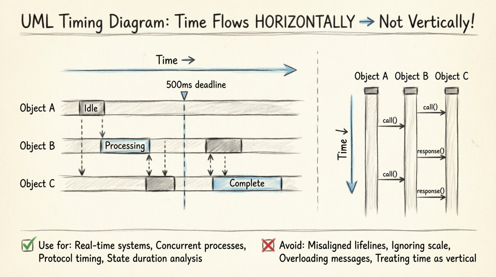
The core truth is that in a standard UML Timing Diagram, time flows horizontally, not vertically. This distinction is not merely aesthetic; it fundamentally changes how you read the data. Understanding this axis orientation is critical for accurate system modeling. This guide breaks down the anatomy of the diagram, clarifies the axes, and explains why treating time as a vertical progression is a critical error in technical documentation.
The Anatomy of Time in UML 📐
To model a system effectively, one must understand the coordinate system of the diagram. In a UML Timing Diagram, the layout follows a specific Cartesian coordinate system, but with unique semantics compared to other chart types.
- Horizontal Axis (X-Axis): This represents Time. It progresses from left to right. This is the fundamental timeline of the system.
- Vertical Axis (Y-Axis): This represents Lifelines. Each horizontal lane corresponds to a specific object, component, or instance within the system.
This structure allows designers to see how different parts of the system evolve simultaneously. When you look at a Timing Diagram, you are looking at a snapshot of state changes across multiple entities as the clock ticks forward.
Why does this matter? If you treat the vertical axis as time, you lose the ability to visualize concurrency. Concurrency is the backbone of real-time systems. If time were vertical, you would be forced to sequence events linearly, which contradicts the nature of parallel processing.
The Sequence vs. Timing Confusion 🔄
The primary source of the myth regarding the vertical time axis is the UML Sequence Diagram. In a Sequence Diagram, time flows from top to bottom. The top of the page is the start of the interaction, and the bottom is the end. This vertical flow emphasizes the order of message passing.
When engineers transition from Sequence Diagrams to Timing Diagrams, they often carry over this mental model. They draw the lifelines horizontally but expect time to flow down. This creates a conflict in the visual language of the model.
Here is the breakdown of the differences:
- Sequence Diagram: Time = Vertical (Top to Bottom). Focus = Order of messages.
- Timing Diagram: Time = Horizontal (Left to Right). Focus = Duration and state values.
Confusing these two leads to inaccurate specifications. A developer reading a Timing Diagram expecting vertical time will misinterpret the duration of processes. They might think a process started later than it actually did, or they might miss the overlap of events that is crucial for performance analysis.
Understanding Lifelines and State Changes 🧩
The vertical axis in a Timing Diagram is not empty space; it is the home of the Lifeline. A lifeline represents an instance of a classifier. In the context of the diagram, it is a specific object or subsystem being monitored.
While the vertical position of a lifeline is static (it stays in its lane), the horizontal movement along that lane represents the history of that object. The diagram captures the state of the object at specific points in time.
State Values on the Axis
Unlike a Sequence Diagram, which focuses on messages, a Timing Diagram focuses on the state of the object. The diagram uses state values to show what the object is doing.
- State Boxes: Rectangles placed on the lifeline indicating a specific state (e.g., "Idle", "Processing", "Error").
- State Values: Text labels that describe the condition of the object at that moment.
- Signals: Events that trigger a state change. These are shown as vertical dashed lines crossing the lifeline.
Because time is horizontal, the length of a state box represents the duration of that state. This is a crucial capability that Sequence Diagrams lack. In a Sequence Diagram, the vertical distance between messages does not represent time. In a Timing Diagram, the horizontal distance does.
Defining Timing Constraints ⏱️
The power of the Timing Diagram lies in its ability to express constraints. These are not just visual markers; they are logical requirements that the system must meet. Since time is horizontal, constraints can be expressed as intervals or specific time points.
Common types of constraints include:
- Duration Constraints: A state must last at least X milliseconds. This is shown by the length of the state box relative to the time axis.
- Deadline Constraints: An event must occur before time T. This is often marked with a dashed line or a specific point on the axis.
- Period Constraints: An event must repeat at a specific frequency. This is visualized as a repeating pattern along the horizontal axis.
When you treat time as a vertical axis, you cannot accurately represent these durations. You cannot easily see if a process is taking too long or if a deadline is being missed if the timeline is compressed into a vertical stack.
For example, in a real-time operating system, a watchdog timer might trigger if a task does not complete within 500 milliseconds. On a Timing Diagram, you draw a vertical guideline at the 500ms mark. If the task state box extends past this line, the requirement is violated. This visualization is only effective if time flows horizontally.
When to Use This Diagram 🎯
Not every system needs a Timing Diagram. It is a specialized tool. You should consider using it when the specific timing of events is critical to the system’s correctness.
Key Scenarios
- Real-Time Systems: Embedded controllers, medical devices, or industrial automation where milliseconds matter.
- Concurrent Processes: Systems where multiple threads or components run simultaneously and must coordinate.
- Protocol Timing: Network protocols where packet arrival times and response windows are defined by specifications.
- State Duration: When the length of time a system stays in a specific state is as important as the state itself.
In contrast, if you are only interested in the logical flow of data without regard for duration, a Sequence Diagram or Activity Diagram is more appropriate. Using a Timing Diagram for simple logical flows adds unnecessary complexity without adding value.
Common Mistakes to Avoid ⚠️
Even with the correct orientation in mind, creating a Timing Diagram requires discipline. Several common errors occur that degrade the utility of the model.
1. Misaligned Lifelines
Ensure all lifelines start at the same time point (usually the left edge). If lifelines start at different points along the time axis, it implies they were initialized at different times, which may not be the intended behavior. If they start together, they should align vertically.
2. Ignoring the Scale
A Timing Diagram implies a scale. If you draw a state box that is twice as wide as another, it should represent twice the duration. Do not draw boxes arbitrarily. If the scale is not linear, the diagram becomes misleading. If time is non-linear (e.g., logarithmic), this must be explicitly noted.
3. Overloading with Messages
Timing Diagrams are not meant to show every single message exchange. They focus on state changes. If you add too many message arrows, the diagram becomes cluttered. Stick to the signals that cause state transitions. Use Sequence Diagrams for the detailed message exchange.
4. Treating Time as Vertical
This is the recurring myth. Do not draw the time axis vertically. Do not align events top-to-bottom. Keep the timeline horizontal. If you are struggling to fit the content, adjust the scale or the layout, not the axis orientation.
Comparing Diagram Types 📊
To solidify the understanding of the horizontal time axis, it helps to compare the Timing Diagram with its closest relative, the Sequence Diagram. The following table highlights the structural differences.
| Feature | Sequence Diagram | Timing Diagram |
|---|---|---|
| Time Axis Direction | Vertical (Top to Bottom) | Horizontal (Left to Right) |
| Primary Focus | Order of Messages | State Changes & Duration |
| Lifeline Representation | Vertical Lines | Horizontal Lanes |
| Duration Representation | Not Applicable | Width of State Boxes |
| Concurrency | Implied via Parallel Frames | Explicit via Overlapping Lanes |
This comparison reinforces why the horizontal axis is essential for Timing Diagrams. The width of the state box is the visual encoding of time duration. This encoding is lost if time flows vertically.
Best Practices for Clarity ✨
Creating a high-quality Timing Diagram involves more than just drawing lines. It requires thoughtful planning to ensure the diagram communicates effectively to the engineering team.
- Define a Time Scale: Clearly label the horizontal axis. Use units like milliseconds (ms), seconds (s), or clock cycles. Do not leave the axis unlabeled.
- Group Related Events: If multiple components react to the same event, align their lifelines to show the correlation visually.
- Use State Names: Instead of generic labels, use descriptive state names (e.g., "Waiting for Input" instead of "State 1").
- Highlight Critical Path: If there is a specific deadline or critical sequence, use bold lines or distinct colors to highlight the path that determines system success.
- Keep Lifelines Consistent: Ensure the vertical position of a lifeline does not change. It should remain in its lane throughout the diagram.
Technical Semantics of the Axis 🧠
From a specification standpoint, the horizontal axis represents the Global Time. It is the reference clock against which all lifelines are measured. This is different from local time. A local clock might reset or run differently, but the diagram assumes a synchronized global timeline for the sake of modeling.
When modeling distributed systems, this global time assumption can be tricky. You must decide if the diagram represents a single machine, a synchronized cluster, or a network where latency is the focus. In network scenarios, the horizontal axis represents network time, and gaps between events represent latency.
The vertical axis, conversely, is the Logical Space. It separates the entities. The distance between lifelines on the vertical axis has no meaning. It is purely for readability. You can move lifelines up or down to avoid overlapping state boxes, but this does not change the system logic.
Final Thoughts on Precision 🎯
The distinction between vertical and horizontal time axes is not a minor detail; it is the foundation of the UML Timing Diagram. Treating time as a vertical axis imports the logic of Sequence Diagrams into a model designed for duration analysis. This leads to ambiguity in specifications and potential errors in implementation.
By adhering to the horizontal time axis, you ensure that duration, concurrency, and state evolution are represented accurately. This clarity is vital for teams building real-time systems, embedded software, and complex protocols. It moves the model from a simple flowchart to a precise engineering specification.
When reviewing a diagram, always check the axis orientation first. If time flows down, it is a Sequence Diagram. If time flows right, it is a Timing Diagram. Recognizing this difference immediately clarifies the intent of the model. With this understanding, your documentation will be more robust, and your team will share a common language for discussing system behavior.
Remember, the goal of modeling is to reduce ambiguity. The horizontal time axis is the tool that allows you to capture the dimension of duration. Do not ignore it. Ensure your diagrams reflect the reality of the system you are designing.