In the world of Internet of Things (IoT), time is not just a metric; it is a fundamental resource. Devices communicate, sensors trigger actions, and processors manage resources within strict temporal boundaries. When a microcontroller misses a deadline, data is lost. When a gateway delays a signal, a smart home system becomes unresponsive. To manage these critical constraints, engineers rely on a specific modeling artifact that often gets overlooked in favor of structural or behavioral diagrams: the UML Timing Diagram. 📉
This guide explores the technical necessity of timing diagrams in embedded and distributed systems. We will examine how visualizing time flows can prevent costly errors in hardware-software integration and ensure system reliability.
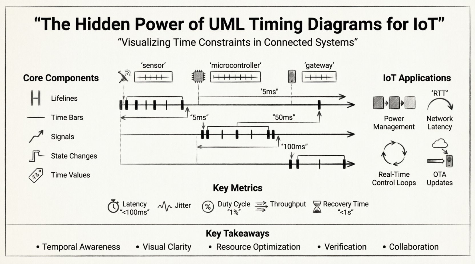
🤔 What Exactly is a UML Timing Diagram?
A UML Timing Diagram is a type of interaction diagram that focuses on the timing constraints of messages exchanged between objects or components. Unlike a Sequence Diagram, which emphasizes the order of events, a Timing Diagram emphasizes the state of objects over time. It maps out when a signal is sent, how long it takes to process, and when the resulting state change occurs.
For IoT architects, this distinction is vital. A device might receive a command (Sequence), but the Timing Diagram reveals if the device can react within the 50-millisecond window required by the user interface or safety protocol.
🛠 Core Components of the Diagram
- Lifelines: Vertical lines representing the lifespan of a specific object, component, or hardware module. In IoT, these often represent sensors, microcontrollers, or network gateways.
- Time Bars: Horizontal segments on a lifeline indicating the duration an object is active or in a specific state. These show processing load and sleep cycles.
- Signals: Arrows indicating the transmission of data or control signals between lifelines.
- State Changes: Vertical lines indicating a switch in the state of an object (e.g., from Idle to Active).
- Time Values: Numerical annotations (e.g., 5ms, 2s) that define strict boundaries for interactions.
⚙️ Why IoT Systems Demand Temporal Modeling
IoT environments are inherently heterogeneous. They combine low-power microcontrollers with high-speed network protocols. This mix creates a complex timing landscape. Standard design patterns often fail to capture the latency introduced by wireless transmission, interrupt handling, or power-saving modes.
🔋 Power Management and Duty Cycling
Many IoT nodes run on batteries. To conserve energy, they enter sleep modes where they do not process data. A Timing Diagram explicitly models the transition from sleep to active states.
- Wake-up Latency: How long does it take the hardware to wake up after a signal is detected?
- Transmission Window: Is the radio ready to transmit immediately upon waking?
- Return to Sleep: How quickly can the system return to a low-power state to preserve battery life?
Without visualizing these transitions, developers might design a protocol that keeps the radio active too long, draining the battery in days rather than years.
📡 Network Latency and Packet Loss
Wireless protocols like LoRaWAN, Zigbee, or MQTT over Wi-Fi introduce variable latency. A Timing Diagram helps define acceptable ranges for these delays.
- Round-Trip Time (RTT): The time from sending a request to receiving a confirmation.
- Timeout Thresholds: If a response does not arrive within X milliseconds, the system must retry or alert the user.
- Buffering: How long can a message wait in a queue before it becomes obsolete?
📊 Timing Diagrams vs. Other UML Models
Understanding where the Timing Diagram fits among other models is crucial for a complete system specification. While Sequence Diagrams show the flow, Timing Diagrams show the constraints.
| Diagram Type | Primary Focus | Best Use Case in IoT |
|---|---|---|
| Sequence Diagram | Order of messages | Defining the handshake protocol between a sensor and a cloud server. |
| State Machine | State transitions | Managing the operational states of a smart lock (Locked, Unlocking, Open). |
| Timing Diagram | Duration and deadlines | Ensuring a safety alarm triggers within 100ms of a fire sensor activation. |
| Activity Diagram | Workflow logic | Mapping the logical steps of a firmware update process. |
Notice the distinction. If you only model the order of messages, you might miss the fact that the message arrives too late to be useful. The Timing Diagram fills that gap.
🚀 Practical Scenarios: When to Use Timing Analysis
Not every component requires a detailed timing model. However, certain IoT subsystems demand rigorous temporal verification.
1. Real-Time Control Loops
In industrial IoT (IIoT), a motor controller must respond to feedback from an encoder. If the control loop is too slow, the motor may oscillate or overshoot the target position. A Timing Diagram maps the sensor read, calculation, and actuator write cycles to ensure the total loop time stays below the critical threshold.
2. Synchronization Protocols
When multiple devices need to act in unison (e.g., smart lighting in a stadium or synchronized sensors in a factory), they rely on clock synchronization. A Timing Diagram illustrates the drift between clocks and the time required to re-synchronize them.
3. Over-the-Air (OTA) Updates
Updating firmware wirelessly involves downloading a large payload, verifying integrity, and flashing memory. This process must not interrupt critical functions. Timing diagrams help define the maximum downtime allowed for a specific device during an update window.
4. Interrupt Handling
Embedded systems rely heavily on interrupts. A high-priority interrupt (like a power failure) must preempt a low-priority task (like logging data). Visualizing these preemption points ensures that the system does not miss the critical event due to a busy background process.
🧩 Structuring the Timing Data
To create a useful diagram, you must define the granularity of time. Choosing the right unit of measurement is essential for clarity.
- Clock Cycles: Used for internal processor operations. Highly precise, but abstract for system-level design.
- Milliseconds (ms): Standard for application-level latency and network packet transmission.
- Seconds (s): Used for user-facing interactions and battery drain calculations.
- Minutes/Hours: Used for maintenance windows, long-term logging, and scheduled tasks.
When modeling, avoid mixing units on the same axis unless there is a clear conversion. Consistency reduces cognitive load for the engineering team.
⚠️ Common Pitfalls in Timing Modeling
Creating these diagrams is straightforward, but creating accurate ones requires discipline. Several common errors can lead to implementation failures.
Assuming Deterministic Behavior
Software running on a general-purpose operating system may not be deterministic. Interrupts, garbage collection, or cache misses can introduce jitter. A timing diagram should reflect the worst-case execution time (WCET), not the average case. Relying on averages in safety-critical IoT applications is a recipe for failure.
Neglecting Background Processes
Many developers model the primary thread of execution but ignore background tasks. If a logging task runs simultaneously with a sensor reading task, the timing of the sensor reading will be delayed. Always account for concurrent threads in the diagram.
Ignoring Hardware Latency
Software does not run in a vacuum. A sensor might have a 10ms physical response time before it even sends a digital signal. A communication bus (like I2C) might have a fixed delay per byte. These hardware characteristics must be included as time bars on the lifelines.
📈 Metrics for IoT Timing Verification
When reviewing a timing diagram, look for these specific metrics to validate system performance.
| Metric | Definition | Typical IoT Threshold |
|---|---|---|
| Latency | Time from event to response | < 100ms for control, < 5s for telemetry |
| Jitter | Variability in timing | Low variability preferred for real-time |
| Duty Cycle | Ratio of active time to total time | Optimized for battery life (e.g., 1%) |
| Throughput | Data volume per time unit | Dependent on network bandwidth |
| Recovery Time | Time to resume normal operation after fault | < 1 second for high availability |
🛠 Integrating Timing into the Development Workflow
Timing diagrams are not just documentation; they are part of the design logic. Here is how to integrate them into the engineering lifecycle.
- Requirement Phase: Define timing constraints in the requirements document (e.g., “System must respond within 200ms”).
- Design Phase: Create the Timing Diagram to verify these constraints are met by the proposed architecture.
- Implementation: Use the diagram to set up hardware timers and software timeouts.
- Testing: Compare actual measured timing against the diagram. If the measured time exceeds the diagram, the design needs optimization.
- Maintenance: Update the diagram when firmware or hardware changes alter timing characteristics.
🔍 Deep Dive: Analyzing Signal Interactions
Let’s look at a specific interaction pattern common in IoT: the Polling Loop.
Imagine a temperature sensor connected to a microcontroller. The microcontroller does not use interrupts; it polls the sensor every 100 milliseconds.
- Lifeline 1 (Microcontroller): Sends a read command.
- Lifeline 2 (Sensor): Takes 5ms to prepare data.
- Lifeline 2 (Sensor): Sends data back (2ms).
- Lifeline 1 (Microcontroller): Processes data (3ms).
- Lifeline 1 (Microcontroller): Enters sleep for remaining time to reach the 100ms cycle.
A Timing Diagram visualizes this gap. If the microcontroller takes 60ms to process data instead of 3ms, the sleep cycle shrinks, and power consumption spikes. This visualization allows engineers to spot inefficiencies before writing a single line of code.
🌐 Distributed Systems and Clock Drift
In a distributed IoT system, devices do not share a single clock. They rely on network time or internal oscillators. Over time, these clocks drift.
A Timing Diagram helps plan the synchronization strategy. It shows the window of opportunity to send a synchronization packet and the time required for the receiving device to adjust its internal clock. If the drift is too high, the diagram highlights the need for a more robust protocol like Precision Time Protocol (PTP) instead of standard NTP.
📉 Visualizing Concurrency
IoT devices often run multiple tasks. A Timing Diagram can show these tasks running in parallel on the same lifeline.
- Task A: High priority, runs every 10ms.
- Task B: Low priority, runs every 100ms.
If Task B runs for 50ms, it blocks Task A for that duration. The diagram reveals if Task A’s deadline is missed. This is critical for systems where missing a deadline causes a safety hazard.
🎯 Final Considerations for Designers
Adopting UML Timing Diagrams requires a shift in thinking from “what happens” to “when it happens.” This shift is non-trivial but necessary for robust IoT design.
- Start Simple: Do not model every millisecond of the entire system. Focus on critical paths first.
- Use Standard Notation: Ensure all team members understand the symbols. Consistency is key.
- Validate with Data: Use profiling tools to gather real timing data to refine the diagram.
- Communicate Constraints: Make the timing requirements visible to hardware engineers, not just software developers.
By treating time as a first-class citizen in your design, you reduce the risk of latency bugs, power failures, and synchronization issues. The effort spent modeling the timeline pays dividends in system stability and performance.
🔗 Summary of Key Takeaways
- Temporal Awareness: IoT systems are time-sensitive. Delays matter.
- Visual Clarity: Timing diagrams show state changes over time, complementing sequence diagrams.
- Resource Optimization: Helps balance performance needs with battery life constraints.
- Verification: Provides a baseline for testing and performance tuning.
- Collaboration: Bridges the gap between hardware limitations and software logic.
When you design the next generation of connected devices, do not skip the timing analysis. It is the hidden layer of reliability that ensures your system works not just logically, but temporally.