Software architecture is undergoing a fundamental shift. The move from monolithic, synchronous systems to distributed, asynchronous environments has reshaped how we model system behavior. At the heart of this transformation lies the challenge of visualizing time. Traditional modeling techniques often struggle to capture the nuances of modern communication patterns. This article examines the trajectory of UML Timing Diagrams as they adapt to the complexities of Event-Driven Architecture (EDA).
Timing diagrams provide a critical view into the temporal aspects of system interactions. They illustrate how objects behave over time, focusing on state changes and signal exchanges. In the context of EDA, these diagrams face new demands. Messages are no longer simple requests and responses; they are events that trigger cascading reactions across distributed nodes. Understanding this evolution is essential for architects aiming to maintain clarity and performance in complex environments.
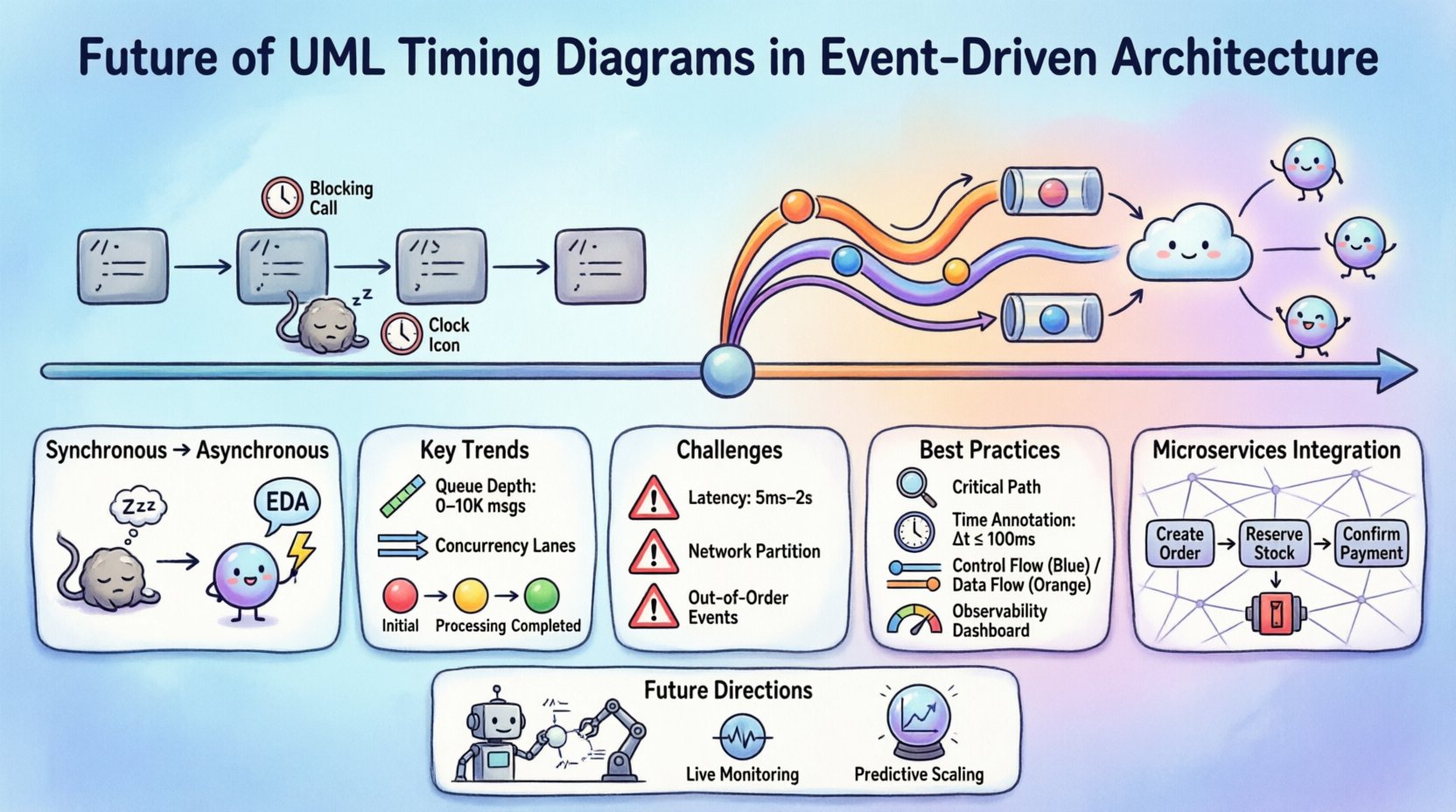
🔄 The Shift from Synchronous to Asynchronous Modeling
Legacy system modeling relied heavily on call-and-return mechanisms. A method invocation blocked execution until a result was returned. Timing diagrams in this context were straightforward. They showed a clear sequence of events along a time axis. The sender waited for the receiver. The relationship was deterministic.
Event-Driven Architecture changes this dynamic. Systems now communicate through event streams. A producer publishes an event without knowing who consumes it. The consumer processes the event at its own pace. This introduces non-determinism into the timing model. The following points highlight the core differences:
- Blocking vs. Non-Blocking: Synchronous calls block threads. Event handlers run asynchronously, often on different threads or processes.
- Direct vs. Indirect: Traditional models show direct connections. EDA models show publishers and subscribers linked by a broker or stream.
- Immediate vs. Delayed: Latency is no longer just network delay. It includes processing queues, buffering, and reordering.
As architects design these systems, the timing diagram must evolve to represent these delays and decoupling mechanisms accurately. The diagram is no longer just about sequence; it is about capacity and flow.
⏱️ Key Evolutionary Trends in Modeling
The structure of UML Timing Diagrams is expanding to accommodate these new realities. Several trends are emerging in how these diagrams are constructed and interpreted in modern design environments.
1. Visualizing Message Queues and Buffers
In synchronous systems, a message travels from point A to point B instantly. In EDA, the message enters a queue. The timing diagram must now represent the queue itself as a lifeline or a distinct state. This allows designers to see where bottlenecks occur. If a queue grows too large, the timing diagram shows the accumulation of messages over time.
Key considerations for modeling queues include:
- Queue Depth: How many messages can be stored before the system rejects new ones?
- Processing Rate: How fast can the consumer handle incoming events?
- Backpressure: How does the system react when the consumer falls behind?
2. Handling Concurrency and Parallelism
Event-driven systems often process multiple events simultaneously. A single trigger might spawn several independent workflows. Traditional timing diagrams struggle to show parallel execution clearly. Modern adaptations introduce multiple time axes or lanes to represent concurrent lifelines.
This approach helps identify race conditions. If two events arrive at nearly the same time, the diagram can visualize which one is processed first. This visibility is crucial for maintaining data consistency in distributed databases.
3. Representing State Machines Over Time
Events often change the state of an object. A timing diagram now integrates state changes more deeply. Instead of just showing a signal, it shows the transition from State A to State B. This is particularly useful for stateful event processors.
When modeling stateful interactions, consider the following:
- State Durations: How long does an object remain in a specific state?
- Timeouts: What happens if an event is not processed within a set time?
- Recovery: How does the system return to a stable state after an error?
📊 Challenges in Visualizing Event Flows
Despite the benefits, modeling timing in EDA presents significant hurdles. The dynamic nature of event streams makes static diagrams less effective. Architects must navigate these challenges to create useful documentation.
| Challenge | Impact on Timing Diagram | Mitigation Strategy |
|---|---|---|
| Non-Deterministic Latency | Time intervals become variable and unpredictable. | Use ranges (min/max) instead of fixed values. |
| Network Partitioning | Messages may be lost or delayed indefinitely. | Include error paths and retry mechanisms in the timeline. |
| Out-of-Order Delivery | Events arrive in a different order than sent. | Model sequence numbers and reordering buffers. |
| Scalability Variations | Performance changes as node count increases. | Annotate diagrams with scaling thresholds. |
One specific challenge is the representation of time itself. In a monolithic system, time is often linear and local. In a distributed system, time is global but inconsistent. Clocks drift. This makes absolute timing difficult to model accurately. Designers often rely on relative timing or logical time to abstract away these physical inconsistencies.
🛠️ Best Practices for Modern Timing Models
To ensure that timing diagrams remain useful in an event-driven context, specific practices should be adopted. These guidelines help maintain clarity without oversimplifying the complexity of the system.
1. Focus on Critical Paths
Not every interaction needs to be drawn. Focus on the paths that impact latency or reliability. Include the core transaction flow and the error recovery flows. Omit low-priority background tasks unless they directly affect the critical path.
2. Annotate Time Constraints Explicitly
Use annotations to specify time bounds. If a message must be processed within 100 milliseconds, state this clearly on the diagram. This prevents ambiguity during implementation. Use units like milliseconds or seconds to avoid confusion.
3. Separate Control and Data Flows
Control signals (e.g., acknowledgments) differ from data payloads. Separate these lifelines. Control flows often require strict timing. Data flows may be buffered. Visual separation helps developers understand which parts of the system require synchronization.
4. Integrate with Observability Data
Static diagrams should eventually reflect reality. Connect the model to monitoring tools. If the diagram predicts a 50ms delay but the logs show 200ms, the model needs updating. This feedback loop ensures the documentation remains accurate.
🔗 Integration with Microservices
Microservices architecture is a natural fit for Event-Driven Architecture. Each service owns its data and logic. They communicate via events to maintain loose coupling. Timing diagrams play a vital role in defining the boundaries between these services.
When modeling microservices, consider the following scenarios:
- Saga Patterns: Long-running transactions that span multiple services. Timing diagrams show the sequence of compensating transactions if a step fails.
- Circuit Breakers: Mechanisms that prevent cascading failures. Diagrams show the timeout thresholds that trigger the breaker.
- Service Mesh: Infrastructure layers that handle traffic. Timing diagrams must account for the overhead introduced by sidecars or proxies.
The granularity of the diagram depends on the scope. A high-level diagram shows service-to-service communication. A detailed diagram shows internal event processing within a service. Both levels are necessary for a complete understanding of the system.
📈 Visualizing Latency and Throughput
Performance is a key driver for adopting Event-Driven Architecture. Timing diagrams are the primary tool for visualizing performance characteristics. They translate abstract concepts like throughput into visual timelines.
1. Latency Analysis
Latency is the time between an event occurring and the system responding. In EDA, this includes:
- Network Propagation: Time to move data across the network.
- Queueing Delay: Time waiting in the message broker.
- Processing Time: Time spent executing the event handler.
A timing diagram breaks these down. It shows where the delay happens. If queueing is high, the bottleneck is the consumer capacity. If processing is high, the code needs optimization.
2. Throughput Modeling
Throughput is the volume of events processed per unit of time. Diagrams can show the rate of events entering and leaving a system. If the input rate exceeds the output rate, the queue grows. This visual cue helps capacity planners make informed decisions about resource allocation.
When analyzing throughput, consider peak loads. A diagram showing average performance might hide critical bottlenecks that occur during traffic spikes. Include stress test scenarios in the modeling process.
🔮 Future Directions and Automation
The future of timing diagrams lies in automation and dynamic generation. Static documents are hard to maintain. As systems evolve, diagrams become outdated quickly. Next-generation modeling environments aim to generate diagrams from code or runtime traces.
Potential advancements include:
- Auto-Generation: Tools that read code repositories and generate timing diagrams automatically.
- Live Monitoring: Diagrams that update in real-time based on system telemetry.
- Prediction Models: Using historical data to forecast future timing behavior.
This shift reduces the maintenance burden. It ensures that the documentation always matches the implementation. However, human oversight remains necessary. Automated diagrams can become cluttered. Architects must curate the views to ensure they remain readable.
🧩 Case Scenarios in Distributed Systems
To illustrate these concepts, consider a typical e-commerce order processing flow. The system uses events to handle inventory, payment, and shipping.
Scenario 1: Inventory Reservation
When an order is placed, an OrderCreated event is published. The inventory service consumes it. A timing diagram shows the time taken to lock the inventory. If the lock fails, a ReservationFailed event is triggered. The diagram shows the retry logic and the timeout.
Scenario 2: Payment Processing
The payment service receives the PaymentRequested event. It communicates with an external bank. This introduces external latency. The diagram must account for the bank’s response time. It also shows the idempotency check to prevent double charging.
Scenario 3: Order Fulfillment
Once payment is confirmed, a PaymentConfirmed event triggers the warehouse. The warehouse service updates its local state. The timing diagram links the inventory reduction to the shipping initiation. It ensures that these events happen in the correct order to prevent overselling.
🛡️ Security and Timing Considerations
Security is often overlooked in timing analysis. However, authentication and authorization steps add latency. In an EDA system, every event must be validated.
Key security timing factors include:
- Token Validation: Checking JWT tokens adds milliseconds to the processing time.
- Encryption/Decryption: Securing messages in transit and at rest takes processing power.
- Audit Logging: Recording every event for compliance adds overhead.
Architects must balance security with performance. A timing diagram helps visualize the cost of these security measures. If the validation step is too slow, the system may need caching or optimized cryptographic algorithms.
📝 Summary of Evolution
The evolution of UML Timing Diagrams reflects the maturation of software architecture. We have moved from simple linear flows to complex, distributed event networks. The diagrams are becoming more sophisticated to capture this reality.
Key takeaways for practitioners include:
- Adaptability: Models must handle non-determinism and variability.
- Granularity: Focus on critical paths and performance bottlenecks.
- Integration: Connect modeling with monitoring and observability tools.
- Clarity: Avoid clutter. Use annotations to explain complex timing constraints.
As systems continue to grow in complexity, the ability to visualize time becomes a competitive advantage. It allows teams to predict issues before they happen. It facilitates communication between developers and operations. It ensures that the architecture supports the business requirements for speed and reliability.
The journey from monolithic to event-driven is complete. The next step is mastering the modeling of this new reality. By updating our timing diagrams, we ensure our documentation evolves alongside our systems. This alignment is the foundation of robust, scalable, and maintainable software.