In the world of system design and software architecture, time is often the most critical constraint. Whether you are building an embedded device, a high-frequency trading platform, or a real-time operating system, understanding exactly when events occur is just as important as knowing what happens. This is where the Unified Modeling Language (UML) Timing Diagram becomes an essential tool. Unlike other diagrams that focus on structure or interaction order, the timing diagram provides a precise view of the state changes of objects over time.
This guide explores how to construct and interpret these diagrams without relying on specific software tools. By understanding the core mechanics, you can translate complex temporal logic into clear, visual documentation that aids communication among developers, engineers, and stakeholders.
What is a UML Timing Diagram? 🧐
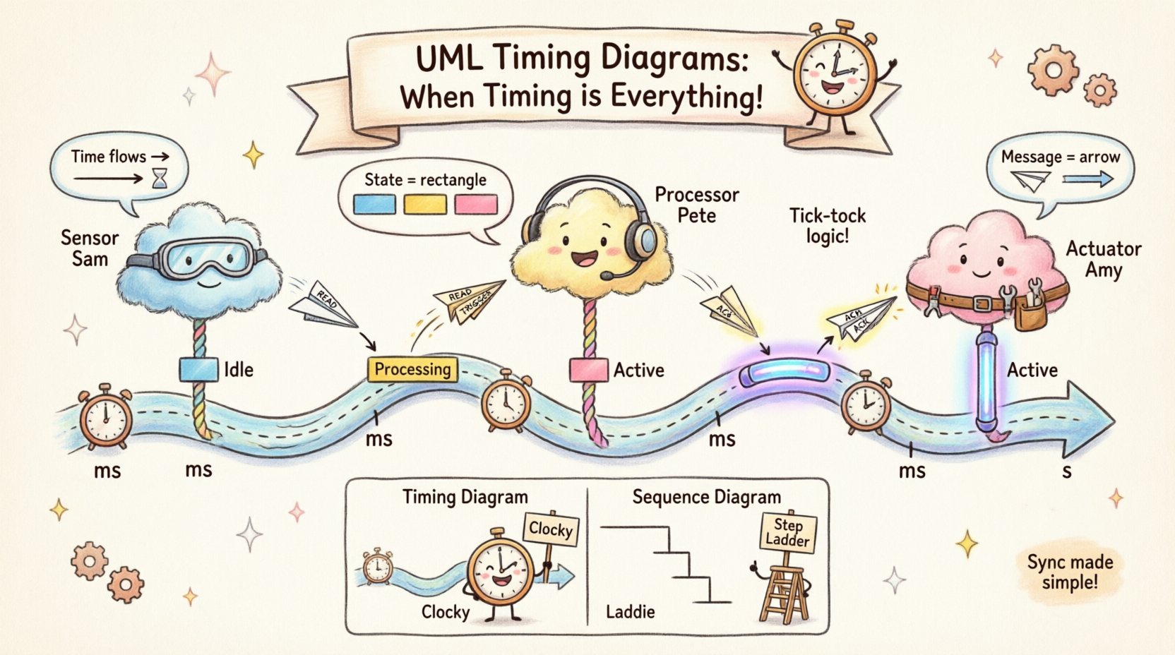
A UML Timing Diagram is a behavioral diagram that shows the behavior of objects over time. It focuses on the changes of state of objects and the messages sent between them within a specific time frame. While a Sequence Diagram tells you the order of events, a Timing Diagram tells you the duration and timing constraints associated with those events.
- Focus: Time and state changes.
- Orientation: Time flows horizontally (left to right).
- Entities: Objects or lifelines are displayed vertically.
- Signals: Messages are shown as transitions or events on the timeline.
Imagine a real-time system controlling a braking mechanism in a vehicle. A sequence diagram might show that the sensor sends data, the processor calculates, and the actuator engages. However, a timing diagram reveals that the sensor data must arrive within 10 milliseconds, the calculation must finish within 5 milliseconds, and the actuator must respond before 20 milliseconds total elapse. This precision is what makes timing diagrams indispensable for performance-critical systems.
Core Components and Anatomy 🛠️
Before drawing, you must understand the vocabulary of the timing diagram. Every element serves a specific purpose in conveying temporal data. Below is a breakdown of the fundamental building blocks.
Key Elements Table
| Element | Visual Representation | Function |
|---|---|---|
| Lifeline | Vertical dashed line | Represents an object or participant over time. |
| Time Axis | Horizontal line with scale | Indicates the passage of time (ms, s, ticks). |
| State Change | Rectangle or bar | Shows when an object is in a specific state. |
| Signal / Message | Arrow or line crossing lifelines | Indicates an event sent from one object to another. |
| Activation Bar | Thin vertical rectangle | Shows when an object is actively processing a task. |
Understanding these components allows you to read the diagram like a blueprint. The vertical axis represents the participants, while the horizontal axis represents the timeline. This orientation flips the typical top-down flow of many other diagrams, requiring a shift in mental perspective.
When to Use Timing Diagrams 📅
Not every system requires a timing diagram. Overusing them can clutter your documentation. You should introduce a timing diagram when temporal constraints are a primary concern. Consider the following scenarios:
- Real-Time Systems: Where missing a deadline can cause system failure.
- Embedded Hardware: Interfacing with sensors, motors, or memory controllers.
- Concurrency Issues: When multiple threads or processes compete for resources.
- Latency Analysis: When the speed of data transmission is critical.
- Interrupt Handling: When external events must preempt current tasks.
If your system is purely transactional without strict time bounds, a Sequence Diagram or State Machine Diagram might be more appropriate. Timing diagrams shine when the when matters as much as the what.
Building a Timing Diagram: Step-by-Step 📐
Creating a valid timing diagram involves a logical process. You do not need specific software to do this; pen and paper or a generic whiteboard are often sufficient for the initial design phase. The goal is clarity and accuracy.
Step 1: Identify the Participants
Start by listing all the objects or components involved in the interaction. These will become your lifelines. Draw vertical dashed lines for each one. Ensure the lifelines are spaced evenly to allow room for events.
Step 2: Define the Time Scale
Establish the horizontal axis. Decide on your unit of measurement. For high-speed embedded systems, you might use microseconds (µs). For web interactions, seconds (s) might suffice. Mark the scale clearly at the top or bottom of the diagram.
Step 3: Map the Initial States
Draw the initial state of each object. This is often represented by a rectangle along the lifeline. For example, a sensor might start in an Idle state, while a controller starts in Active.
Step 4: Add Messages and Events
Draw arrows or lines to represent signals sent between lifelines. Place these at the exact point on the time axis where the event occurs. If a message takes time to process, indicate the duration.
Step 5: Show State Transitions
Update the state rectangles along the lifelines as time progresses. If an object changes from Idle to Processing, draw a transition bar at the specific time point.
Step 6: Verify Constraints
Review the diagram against your requirements. Does the total time meet the deadline? Are there any race conditions where two lifelines interact unpredictably? Adjust the spacing or logic as needed.
Common Patterns and Logic Structures 🔄
Certain patterns recur frequently in timing diagrams. Recognizing these can speed up your design process.
1. Synchronous Calls
In a synchronous call, the sender waits for the receiver to finish before continuing. Visually, the activation bar of the sender overlaps with the receiver until the response is received.
- Use Case: Function calls in a single-threaded environment.
- Visual: Continuous activation bars spanning across the interaction.
2. Asynchronous Messages
Here, the sender sends a message and continues without waiting for a response. The receiver processes the message independently.
- Use Case: Logging events, background tasks.
- Visual: The sender’s activation bar does not block; it continues immediately after sending.
3. Interrupts and Preemption
An interrupt forces the current process to pause and handle a higher-priority event. This is crucial for real-time systems.
- Use Case: Hardware interrupts, error handling.
- Visual: A dashed line cuts across an activation bar, indicating a pause, followed by a new processing bar.
4. Periodic Tasks
Scheduled tasks that repeat at fixed intervals. This is common in control loops.
- Use Case: Refreshing a display, polling sensors.
- Visual: Repeating activation bars at regular intervals on the time axis.
Timing Diagram vs. Sequence Diagram ⚖️
It is common to confuse Timing Diagrams with Sequence Diagrams because both deal with object interactions. However, they serve different analytical purposes. The following table highlights the distinctions.
| Feature | Timing Diagram | Sequence Diagram |
|---|---|---|
| Primary Focus | Time duration and state changes | Order of messages and interactions |
| Time Axis | Explicit horizontal scale | Implicit (top to bottom) |
| Concurrency | Shows parallel execution clearly | Shows parallelism but less precise timing |
| Complexity | Higher detail required for time | Focuses on logical flow |
| Best For | Real-time constraints | Workflow logic |
Using the wrong diagram for the wrong purpose can lead to ambiguity. If you need to prove that a system meets a 50ms deadline, a Sequence Diagram is insufficient. You need the granularity of a Timing Diagram.
Best Practices for Clarity 🎯
A diagram that is too complex defeats its purpose. Follow these guidelines to ensure your timing diagrams remain readable and useful.
- Keep Time Scales Consistent: Do not switch from milliseconds to seconds halfway through without a clear break or scale change.
- Group Related Lifelines: If multiple objects belong to the same subsystem, place them close together to reduce line crossing.
- Label State Values: Clearly label what state an object is in during a bar (e.g., Reading, Writing, Idle).
- Use Annotations: Add text notes to explain complex timing constraints or external dependencies.
- Limit Scope: Focus on one specific interaction scenario. Do not try to show every possible path in one diagram.
- Align with Standards: Adhere to standard UML notation to ensure anyone familiar with the language can read it.
Common Pitfalls to Avoid ⚠️
Even experienced modelers make mistakes when dealing with time. Be aware of these common errors.
- Ignoring Latency: Assuming messages are instantaneous. In reality, network or bus latency exists.
- Overlapping States: Drawing states that cannot logically exist at the same time.
- Misinterpreting Activation: Confusing an object being active with an object being idle but waiting.
- Unclear Time Units: Failing to specify if the axis is ticks, milliseconds, or seconds.
- Too Many Lifelines: Creating a diagram with 20+ lifelines makes it unreadable. Split the diagram into subsystems.
Maintaining and Updating Documentation 📝
Once a timing diagram is created, it becomes part of the system’s documentation. It must be maintained as the system evolves.
When requirements change, update the diagram immediately. If a new sensor is added to the loop, the timing diagram must reflect the new latency and processing time. If the deadline tightens, the diagram serves as a baseline to identify bottlenecks.
Version control is essential. Treat your diagrams like code. Keep a history of changes so you can trace back why a specific timing constraint was set. This is particularly important in regulated industries like automotive or medical devices where traceability is mandatory.
Advanced Considerations for Complex Systems 🔧
For highly complex systems, standard timing diagrams may need extension. Some advanced modeling approaches include:
- Multiple Time Scales: Using different scales for different parts of the diagram (e.g., macro time for the whole system, micro time for a specific subroutine).
- Value Changes: Instead of just state changes, show the actual value of a variable over time (e.g., temperature rising linearly).
- Resource Constraints: Indicate when a specific resource (like a bus) is occupied, preventing other lifelines from communicating.
- Deadlines and Jitter: Explicitly mark deadlines with vertical dashed lines and show the variation (jitter) in response times.
These advanced features allow engineers to model physical realities more accurately. They bridge the gap between abstract software logic and physical hardware behavior.
Integrating Timing Diagrams into the Workflow 🔄
Where does this diagram fit in the development lifecycle? It is typically created during the design phase, after the requirements are defined but before coding begins. It serves as a contract between the system architect and the implementation team.
During testing, the diagram can be used to verify performance. If the measured latency deviates significantly from the diagram, it indicates a bug or a hardware issue. In maintenance, it helps new engineers understand the temporal dependencies they might accidentally break when refactoring code.
Final Thoughts on Visualizing Time 👁️
Time is an invisible resource that dictates the success of many systems. By translating temporal logic into visual elements, you make the abstract concrete. A well-drawn timing diagram reduces risk, clarifies requirements, and ensures that all team members share the same understanding of system performance.
Start simple. Focus on the critical paths first. As your understanding of the system deepens, you can add more detail. Remember that the goal is not just to draw lines, but to communicate constraints clearly. With practice, these diagrams become a natural part of your design toolkit, helping you build systems that are not just functional, but reliable and timely.