In the landscape of system modeling, visualizing behavior is only part of the equation. Understanding when that behavior occurs is equally critical. While sequence diagrams illustrate the order of interactions, they often lack the precision required for real-time systems. This is where the UML Timing Diagram becomes an indispensable tool for architects and engineers. It provides a precise view of the state of objects over time, focusing on the timing of events rather than just their order.
This guide explores the core mechanics of timing diagrams. We will dissect the anatomy of lifelines, interpret the significance of activation bars, and analyze how time triggers function within a model. By the end of this deep dive, you will possess a robust understanding of how to construct and interpret these diagrams for complex temporal analysis.
📏 The Foundation: Understanding the Time Axis
Before examining individual elements, one must grasp the coordinate system of the diagram. Unlike sequence diagrams where time flows downwards, timing diagrams typically feature a horizontal time axis. However, some notations allow for vertical time representation. The standard convention places time progressing from left to right.
- Time Origin: The starting point of the timeline, often denoted as time zero.
- Time Interval: The distance between two points on the axis represents a specific duration.
- Time Scale: Units can vary (milliseconds, seconds, clock cycles) depending on the system being modeled.
This horizontal progression allows for the visualization of parallel processes. Multiple lifelines can run simultaneously, showing how different parts of a system react within the same time window. This is crucial for detecting race conditions or latency issues.
📍 Lifelines: The Backbone of Temporal Analysis
Lifelines serve as the vertical or horizontal tracks upon which events occur. In the context of a timing diagram, a lifeline represents an instance of a classifier. It is the continuous existence of an object or system component over a specific period.
🔹 Key Characteristics of Lifelines
- Existence: A lifeline exists from the moment an object is created until it is destroyed.
- State Changes: While the lifeline represents the object, the state of that object changes at specific points along the timeline.
- Focus of Control: A special type of lifeline, the Focus of Control, indicates the duration during which an object is executing an operation.
When modeling embedded systems or network protocols, lifelines often represent hardware components, software modules, or external interfaces. Keeping lifelines distinct and clearly labeled is vital for readability. If multiple instances of the same class exist, each must have its own unique lifeline to avoid ambiguity regarding which instance is responding to a trigger.
🟦 Activation Bars: Visualizing Execution
Activation bars (sometimes called execution occurrences) are rectangular regions placed on a lifeline. They indicate the period during which an object is actively performing an operation. This is not merely a point in time; it is a duration of work.
🔹 What Activation Bars Communicate
- Duration: The length of the bar corresponds to the time taken to complete the operation.
- Concurrency: If two bars overlap horizontally, it indicates that the operations are running concurrently on the same lifeline (reentrancy) or different lifelines.
- Interruptibility: A break in an activation bar might indicate an interruption or a pause in execution.
Understanding activation bars is essential for performance analysis. If an operation is expected to complete in 10 milliseconds but the activation bar spans 50 milliseconds, the model reveals a performance bottleneck. This visual cue helps identify where delays are accumulating within a process.
Note: In some notations, activation bars are replaced by focus of control bars. While similar, the focus of control specifically highlights the active execution context, whereas an activation bar simply marks the operation’s duration.
⏱️ Time Triggers: The Catalysts of Change
Events do not happen in a vacuum. They are triggered by signals, messages, or specific time constraints. In a timing diagram, these triggers are the arrows or annotations that connect lifelines or mark points on the axis.
🔹 Types of Triggers
- Signal Messages: Asynchronous events sent from one lifeline to another. Unlike method calls, signals do not wait for a return value immediately.
- Time Constraints: Conditions that must be met before an action proceeds. For example, “Wait until 5 seconds have passed.”
- State Changes: Transitions in the internal state of an object that act as a trigger for subsequent actions.
When a signal is sent, it is depicted as a line connecting two lifelines. The line may be solid or dashed. A solid line typically represents a synchronous call or a signal that expects a response. A dashed line often represents a signal or an asynchronous message where the sender does not wait for an acknowledgment.
🔹 Time Delays and Latency
One of the most powerful features of timing diagrams is the ability to explicitly model delays. If a message is sent but not received immediately, the gap between the sender and the receiver on the timeline represents network latency or processing time.
For example, in a sensor network, a data packet might be generated by a sensor node. The timing diagram shows the exact moment the data is created and the exact moment it is processed by the central controller. The horizontal distance between these two points is the system latency. Engineers use this to verify if the system meets real-time requirements.
📊 Comparing Elements: A Structured View
To clarify the relationships between different components, the following table breaks down the standard elements found in a UML Timing Diagram.
| Element | Description | Visual Representation | Primary Use Case |
|---|---|---|---|
| Lifeline | Represents an object or participant over time. | Vertical or horizontal line. | Tracking object existence. |
| Activation Bar | Indicates active execution of an operation. | Rectangular box on the lifeline. | Measuring operation duration. |
| Message Arrow | Shows communication between lifelines. | Arrow connecting lifelines. | Indicating data flow or signals. |
| Time Constraint | Defines a specific time requirement. | Text label within braces, e.g., [t > 5s]. | Enforcing timing rules. |
| Focus of Control | Indicates the object is executing a method. | Narrow rectangle on the lifeline. | Highlighting active control. |
🛠️ Advanced Concepts: Nested Lifelines and Time Constraints
As systems grow in complexity, simple linear diagrams become insufficient. Advanced timing diagrams utilize nested lifelines and complex time constraints to model hierarchical behavior.
🔹 Nested Lifelines
Nesting allows you to show that a lifeline belongs to another. This is common in object-oriented modeling where a container object manages multiple sub-components. Visually, the sub-component lifeline is drawn inside the boundaries of the parent lifeline. This structure helps in understanding scope and ownership of resources during specific time intervals.
🔹 Time Constraints and OCL
Time constraints are often expressed using mathematical notation or Object Constraint Language (OCL). These constraints define the boundaries within which an operation must occur.
- Pre-conditions: Requirements that must be true before a time interval begins.
- Post-conditions: Requirements that must be true after a time interval ends.
- Invariant: A condition that must hold true for the entire duration of the operation.
For instance, a safety system might require that a valve closes within 200 milliseconds of a pressure spike detection. This is modeled as a time constraint on the activation bar of the valve controller. If the bar extends beyond the 200ms mark, the diagram indicates a violation of the safety protocol.
🔄 Timing vs. Sequence: Choosing the Right Tool
It is common to confuse timing diagrams with sequence diagrams. Both deal with interactions, but their focus differs significantly. Understanding the distinction prevents misuse of modeling tools.
| Feature | UML Timing Diagram | UML Sequence Diagram |
|---|---|---|
| Primary Focus | Time duration and state changes. | Order of messages and logic flow. |
| Time Axis | Explicit (Horizontal or Vertical). | Implicit (Downwards). |
| Concurrency | High visibility of parallel processes. | Linear representation of calls. |
| Detail Level | Quantitative (How long?). | Qualitative (What happens?). |
Use a sequence diagram when defining the logical flow of a feature. Use a timing diagram when validating performance, latency, or synchronization between components. Often, a project will utilize both: the sequence diagram defines the logic, and the timing diagram validates the performance of that logic.
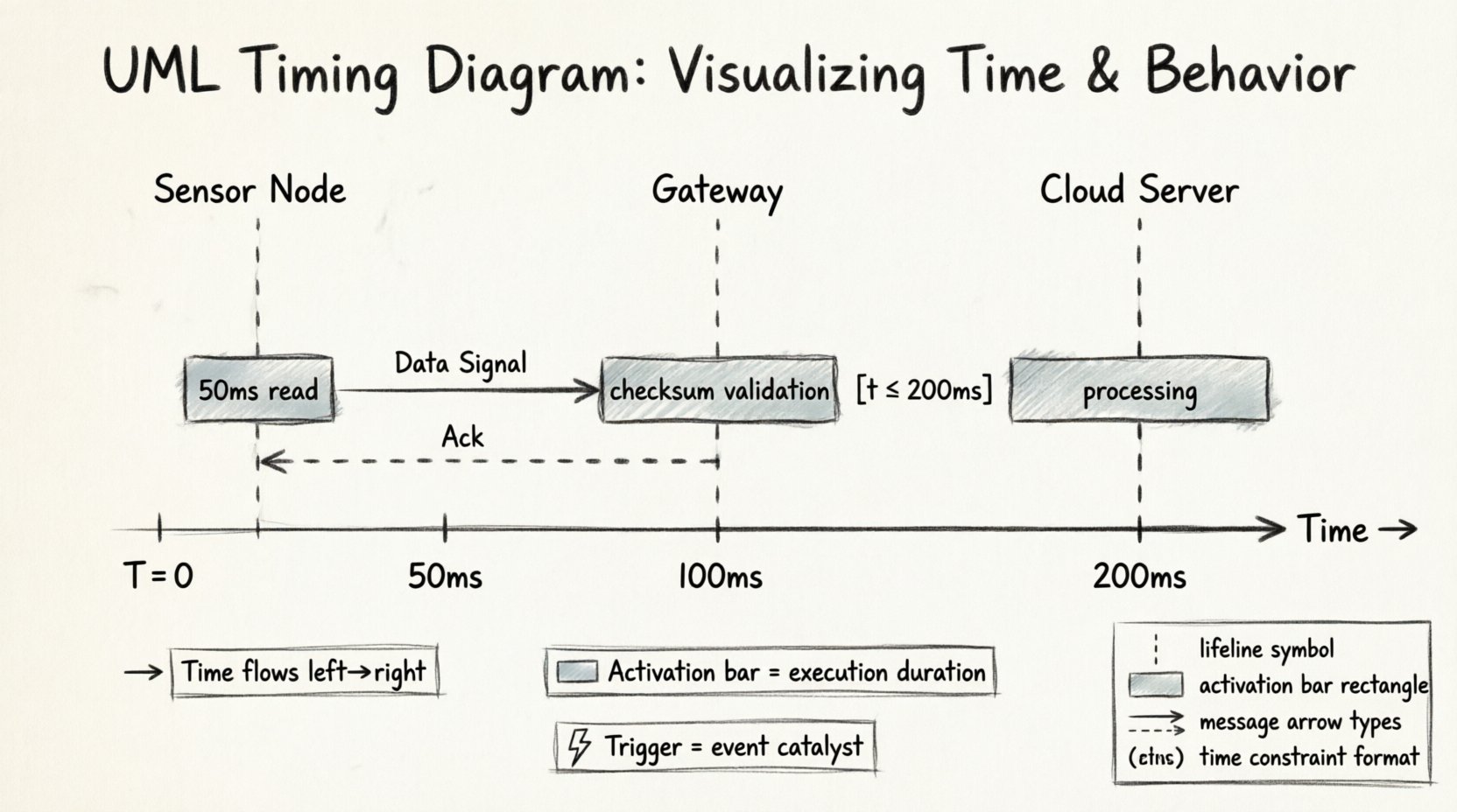
🚀 Practical Application: A Sensor Network Scenario
To illustrate these concepts, consider a scenario involving an environmental monitoring system. This system consists of a Sensor Node, a Gateway, and a Cloud Server.
🔹 Step 1: The Sensor Node
The Sensor Node monitors temperature. At time T=0, it wakes up. An activation bar begins on the Sensor Node lifeline. It reads the data, which takes 50 milliseconds. This is shown as a short activation bar.
🔹 Step 2: Transmission
Once the read is complete, the Sensor Node sends a signal to the Gateway. A message arrow points from the Sensor to the Gateway. The transmission time is 100 milliseconds. During this period, the Sensor Node lifeline remains active, indicating it is waiting for acknowledgment.
🔹 Step 3: Gateway Processing
The Gateway receives the signal. It performs a checksum validation. This activation bar is longer, indicating more complex processing. If the checksum fails, a timeout trigger occurs after 5 seconds, and the message is discarded.
🔹 Step 4: Cloud Update
Finally, the Gateway sends data to the Cloud Server. The Cloud Server processes the data and sends an acknowledgment back. The total round-trip time is measured on the diagram. If the total time exceeds 2 seconds, the system is flagged as too slow for real-time alerts.
This scenario demonstrates how activation bars and triggers work together to create a complete picture of system performance. It moves beyond “does it work?” to “does it work fast enough?”
⚠️ Common Pitfalls in Modeling
Creating these diagrams is straightforward, but creating accurate ones requires discipline. Several common errors can lead to misinterpretation of the system behavior.
- Ignoring Latency: Drawing messages as instantaneous lines without considering transmission time. This leads to optimistic models that fail in production.
- Overcrowding: Fitting too many lifelines into a single view. This makes it impossible to trace specific interactions. Split diagrams into logical groups if necessary.
- Inconsistent Time Scales: Mixing different units (e.g., seconds and milliseconds) without clear labeling. Always define the time scale explicitly.
- Missing Destroy Events: Failing to show when an object is destroyed. This can imply an object persists indefinitely when it should be garbage collected or shut down.
- Confusing Control Flow with Data Flow: Using activation bars for data storage rather than active processing. Activation bars should only represent active computation or execution.
📝 Best Practices for Clarity
To ensure your diagrams are effective communication tools, adhere to these guidelines.
- Label Everything: Every lifeline, message, and constraint should have a clear label. Ambiguity is the enemy of technical documentation.
- Use Groups: If you have many components, group them by subsystem. This reduces visual noise.
- Highlight Critical Paths: Use bold lines or distinct colors (if your tool supports it) to highlight the critical path that determines total system latency.
- Document Assumptions: Add text notes explaining the time units and any assumptions made about network stability or hardware speed.
- Review Iteratively: Timing models evolve as the system evolves. Revisit diagrams when performance requirements change.
🧩 Integrating with State Machines
Timing diagrams often complement State Machine Diagrams. While state machines describe the discrete states of an object, timing diagrams describe the temporal behavior of transitions between those states.
For example, a state machine might show a transition from “Idle” to “Active”. The timing diagram specifies how long the “Active” state lasts before the object returns to “Idle”. This integration provides a comprehensive view of both logical state and temporal constraints. It is particularly useful in embedded systems where a timeout in a specific state can trigger a reset or a fallback mechanism.
🔍 Analyzing Performance Bottlenecks
One of the most valuable outcomes of a timing diagram is the identification of bottlenecks. By visually inspecting the activation bars, you can spot where time is being spent.
- Long Activation Bars: Indicate heavy processing or complex algorithms that may need optimization.
- Large Gaps: Indicate waiting periods, communication delays, or resource contention.
- Overlapping Bars: Indicate potential concurrency issues or race conditions if resources are shared.
Engineers use this data to refactor code, optimize network protocols, or upgrade hardware. The diagram serves as a visual audit of the system’s temporal health.
📜 Conclusion on Temporal Modeling
Mastery of the UML Timing Diagram is not about memorizing symbols; it is about understanding the flow of time within a system. By correctly utilizing lifelines, activation bars, and time triggers, you create a model that speaks the language of time itself. This precision is what separates theoretical design from deployable, reliable software and hardware systems.
Remember that diagrams are living documents. As your system grows, so should your understanding of its temporal dynamics. Keep the model updated, keep the time scales accurate, and use the visual power of the diagram to guide your team toward robust, real-time solutions.