Understanding the flow of time within a software system is critical for developers and architects. While standard sequence diagrams show what happens, timing diagrams reveal when it happens. This guide provides a detailed walkthrough of UML timing diagrams, focusing on reading existing charts and creating new ones from scratch. We will explore the notation, the rules of interaction, and the specific scenarios where this visual tool offers the most value.
Whether you are working on embedded systems, real-time applications, or complex microservices, grasping temporal dependencies is essential. This tutorial avoids fluff and focuses on practical application. We will cover the anatomy of the diagram, the syntax of messages, and the logic behind concurrent execution.
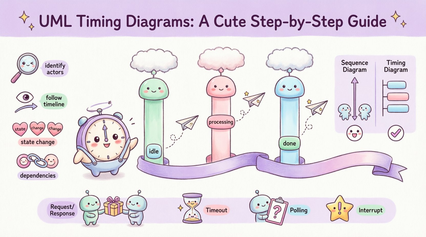
🧩 Understanding the Core Purpose
A timing diagram is a type of interaction diagram in the Unified Modeling Language (UML). It is used to analyze and describe the behavior of objects over time. Unlike a sequence diagram, which focuses on the order of messages between objects, a timing diagram focuses on the state changes of objects and the duration of interactions.
Think of it as a timeline of events. It allows you to visualize:
- When a specific condition becomes true.
- The duration of an operation or process.
- Concurrent activities happening simultaneously.
- Time-dependent constraints, such as timeouts or deadlines.
This level of detail is often necessary when system performance depends on precise timing. For example, if a sensor reads data and a controller must respond within 50 milliseconds, a timing diagram is the ideal way to model that requirement.
📏 Anatomy of a Timing Diagram
Before drawing or interpreting a diagram, you must understand its components. The layout is distinct from other UML charts. The horizontal axis represents time progressing from left to right. The vertical axis represents distinct objects or lifelines.
1. Lifelines and Object Instances
Each object participating in the interaction is represented by a vertical rectangle or line called a lifeline. This is not just a line; it represents the existence of the object throughout the timeline. In a timing diagram, the lifeline often includes a column of state information rather than just a simple line.
- Position: Objects are arranged horizontally at the top.
- Identity: Each lifeline has a unique name, usually derived from the class name or the specific instance name.
- Scope: The diagram only shows the objects relevant to the specific interaction being modeled.
2. The Time Axis
The horizontal axis is the timeline. It is usually marked with ticks or intervals to indicate duration. There is no strict requirement for the scale to be linear, but for most analysis, linear scaling is preferred for clarity. You can define units of time, such as milliseconds, seconds, or clock cycles.
3. State Information
Unlike sequence diagrams, timing diagrams show the state of the object over time. This is often depicted as a change in the color or fill of the lifeline, or a text box indicating the current value or mode. For instance, a variable might change from idle to processing to done.
4. Activation Bars (Focus of Control)
When an object is actively performing an operation, it is shown with a vertical bar on its lifeline. This is called an activation bar or focus of control. It indicates that the object is busy and cannot accept other messages during this period. The bar starts when the message is received and ends when the response is sent or the operation completes.
5. Signals and Messages
Interactions between objects are shown as arrows or lines connecting lifelines. In a timing diagram, these are often represented with time constraints attached to them. An arrow pointing from one lifeline to another indicates a message sent or a signal received.
📖 How to Read a Timing Diagram
Reading a timing diagram requires scanning from left to right, following the flow of time. You must track the state of each lifeline independently while observing how they synchronize.
Step 1: Identify the Actors
Start at the top. List all the lifelines. Ask yourself what each object represents in the system. Are they controllers, sensors, databases, or user interfaces? Knowing the role helps interpret the state changes.
Step 2: Follow the Timeline
Move horizontally across the diagram. Look for the first event on the left. This is the trigger. It might be a user action, a system clock tick, or an incoming external signal. Note which lifeline is affected.
Step 3: Analyze State Changes
Look for the vertical bars on the lifelines. When a bar appears, the object is active. Check the text associated with the bar. Is it processing data? Is it waiting? This tells you the internal logic of the object during that timeframe.
Step 4: Check Dependencies
Look at the connections between lifelines. If Object A sends a message to Object B, Object B cannot process that message until it arrives. In timing diagrams, the arrival time is often explicit. This helps you identify bottlenecks. If Object B is busy with a previous task when the message arrives, the message might be queued or delayed.
✍️ How to Draw a Basic Timing Diagram
Creating a timing diagram is a structured process. You do not just draw lines; you define the context first. Follow these steps to ensure accuracy and clarity.
Step 1: Define the Scenario
Decide what specific behavior you are modeling. Is it a login process? A data transmission protocol? A timeout mechanism? Write a brief description of the scenario to keep the scope clear. This prevents the diagram from becoming too crowded.
Step 2: Set Up the Lifelines
Draw vertical lines for each object involved. Arrange them logically. Often, the sender is placed on the left and the receiver on the right, but this is flexible. Label each line clearly. Use the full name of the class or a descriptive instance name.
Step 3: Mark the Time Axis
Draw a horizontal line at the bottom or top to represent time. Mark intervals. If the scenario involves milliseconds, label the ticks. If it is abstract, simply label it “Time”. Ensure the scale allows enough space for the events to be distinct.
Step 4: Add Messages and Signals
Draw arrows between lifelines to represent messages. In a timing diagram, you often draw the message at the specific point in time it occurs. Use solid lines for synchronous calls and dashed lines for asynchronous signals. Add labels to the arrows indicating the message name.
Step 5: Indicate Activation and State
For every message received, draw a vertical bar on the receiving lifeline to show the period of activity. If the object has a state (like waiting or active), annotate the lifeline with text boxes or color changes to reflect this status over time.
Step 6: Review Timing Constraints
Check if any delays or deadlines are mentioned. You can add text annotations near the arrows or bars to specify these constraints. For example, “Response required within 200ms”. This adds semantic value to the visual.
⚖️ Timing Diagram vs. Sequence Diagram
It is common to confuse timing diagrams with sequence diagrams. Both model interactions, but they serve different purposes. Understanding the distinction helps you choose the right tool.
| Feature | Sequence Diagram | Timing Diagram |
|---|---|---|
| Focus | Order of messages | Time duration and state |
| Time Axis | Implicit (vertical order) | Explicit (horizontal axis) |
| State | Usually not shown | Explicitly shown on lifelines |
| Concurrency | Harder to visualize | Easily visualized |
| Best Use | Logic flow | Performance and real-time behavior |
🔍 Advanced Concepts: Concurrency and Synchronization
In complex systems, multiple threads or processes often run at the same time. Timing diagrams are excellent for visualizing this concurrency. When two lifelines are active at the same horizontal position, they are executing in parallel.
Handling Parallel Execution
If Object A and Object B are independent, draw their activation bars at the same time interval. This shows that the system is utilizing resources simultaneously. If Object A is waiting for Object B to finish before proceeding, you will see the activation bar for A stop until B’s bar ends.
Signal Timing and Delays
Sometimes, a message is not delivered instantly. Network latency or processing queues introduce delays. In the diagram, this is shown by the gap between the outgoing arrow and the incoming arrow. You can label this gap with the estimated delay time. This is crucial for understanding system responsiveness.
🛠 Common Patterns and Use Cases
While every system is unique, certain patterns appear frequently. Recognizing these patterns helps in both reading and drawing diagrams efficiently.
- The Request-Response Pattern: Object A sends a request, waits (bar appears), and receives a response. The duration of the bar represents the processing time.
- The Timeout Pattern: Object A sends a request. If no response arrives by time T, Object A triggers a timeout handler. This is shown by a separate signal branching off the original lifeline.
- The Polling Pattern: Object A repeatedly checks a status on Object B at fixed intervals. This looks like a series of periodic messages from A to B.
- The Interrupt Pattern: Object A is processing, but a high-priority signal from Object B interrupts it. The activation bar for A is split or paused, and the bar for B takes precedence.
⚠️ Troubleshooting Common Errors
When creating these diagrams, beginners often make specific mistakes that reduce clarity. Avoid these pitfalls to ensure your documentation is effective.
1. Inconsistent Time Scales
Do not mix different time units on the same axis without clear labeling. If one section is in seconds and another in milliseconds, the visual comparison becomes misleading. Use a single unit for the entire diagram or clearly mark the transition.
2. Overcrowded Lifelines
Do not put too many objects on one line. If a lifeline represents a complex object, consider splitting it into sub-lifelines or creating a separate diagram for its internal behavior. Clutter makes the timing relationships impossible to follow.
3. Missing State Labels
A diagram without state information is just a sequence diagram with a time axis. Ensure you label the states (e.g., Ready, Busy, Idle) so the reader knows what the object is doing during the activation bar.
4. Ignoring Latency
Assuming messages arrive instantly is a common error. If your system involves network communication or database queries, acknowledge the travel time of the message. Draw the arrow length or add a gap to reflect this reality.
📝 Best Practices for Clarity
Good documentation is about communication. Use these practices to make your timing diagrams accessible to other team members.
- Use Consistent Notation: Stick to one style for activation bars and message arrows throughout the project.
- Group Related Interactions: If a complex interaction involves many steps, consider breaking it into multiple smaller diagrams rather than one giant chart.
- Label Time Units: Always define what the horizontal ticks represent. “ms”, “s”, or “cycles”.
- Keep it Readable: Avoid crossing lines where possible. If lines must cross, use small gaps or arcs to indicate the connection point clearly.
- Review with Stakeholders: Show the diagram to the developers and architects. If they cannot interpret the timing logic quickly, simplify the notation.
🚀 Final Considerations
Mastering the ability to model time is a valuable skill for technical roles. It bridges the gap between abstract logic and physical reality. By understanding the constraints of time, you can design systems that are not only functionally correct but also performant.
Start by practicing with simple scenarios. Draw the flow of a single request. Then expand to concurrent processes. As you become more comfortable, you will find that timing diagrams become an essential part of your design toolkit. They provide the clarity needed to resolve complex interaction issues before code is written.
Remember that these diagrams are living documents. As the system evolves, the timing requirements may change. Keep the diagrams updated to reflect the current state of the application. This ensures that future maintenance remains efficient and that new team members can quickly grasp the temporal dependencies of the system.
With practice, reading and drawing these charts will become second nature. Focus on the logic of time, the flow of control, and the state of the objects. This approach will lead to robust and well-documented software architectures.