


Concurrency is one of the most persistent challenges in system design. Threads, processes, and asynchronous events often collide in ways that are difficult to predict during development. When standard flowcharts or sequence diagrams fall short of capturing the temporal aspect of these interactions, a UML Timing Diagram becomes the essential tool for clarity.
This guide provides a structured approach to visualizing timing constraints and concurrent behaviors. We will move from basic definitions to practical application, focusing on identifying race conditions and synchronization errors. By the end of this session, you will understand how to construct these diagrams effectively without relying on complex tooling or lengthy training.
Understanding the Core Purpose 🎯
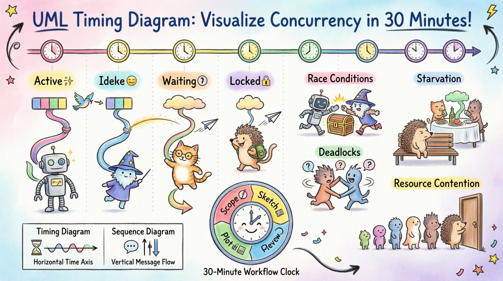
A Timing Diagram is a behavioral diagram that shows how objects change their state over time. Unlike a Sequence Diagram, which focuses on the order of messages, a Timing Diagram focuses on the exact timing relationships between events and states. This distinction is critical when dealing with parallel execution paths.
When multiple components operate simultaneously, the relative timing of their actions determines system stability. A delay in one thread might starve another, or a signal arriving slightly too late could trigger an invalid state. Visualizing these relationships allows architects to spot potential failures before code is written.
Why Timing Diagrams Matter for Concurrency
- Visibility of Overlap: You can see exactly when two processes occupy the same resource.
- Deadline Verification: Critical operations must complete within specific windows; this diagram highlights those windows.
- State Transitions: It tracks how a specific object changes state as time progresses, rather than just what messages it receives.
- Parallelism Analysis: It explicitly models concurrent lifelines, making interaction visibility clearer than in linear flowcharts.
Anatomy of a Timing Diagram 🛠️
Before starting the 30-minute workflow, it is necessary to understand the notation. These diagrams rely on a horizontal time axis and vertical lifelines. Each element serves a specific purpose in communicating temporal constraints.
Key Components
- Lifelines: Vertical dashed lines representing the existence of an object or a system component. In concurrency, each thread or process gets its own lifeline.
- Time Axis: A horizontal axis at the top indicating the progression of time. It is usually linear, but can represent logical time in distributed systems.
- Activation Bars: Rectangles placed on the lifeline indicating when an object is actively performing a task. The width of the bar represents the duration of the activity.
- State Boxes: Rectangular regions indicating the state of an object at a specific time (e.g., Active, Idle, Waiting).
- Signals: Arrows pointing between lifelines to denote events or messages triggering state changes.
The 30-Minute Workflow ⚡
Creating a useful diagram does not require hours of planning. The goal is to capture the critical paths that cause the most friction in your system. Follow this structured protocol to achieve a high-fidelity representation in a short timeframe.
Minutes 0-5: Define the Scope
Do not attempt to diagram the entire system. Select a specific module where concurrency is known to cause issues. Common candidates include:
- Database connection pooling
- Real-time data processing pipelines
- Interrupt handling in embedded systems
- Asynchronous API request aggregation
Write down the primary actors involved. Limit this list to three or four distinct threads or processes to keep the diagram readable.
Minutes 5-15: Sketch the Lifelines
Draw your vertical lines. Label them clearly with the names of the processes or objects. Ensure the spacing between lines is wide enough to accommodate state changes.
Mark the start and end times for the scenario you are analyzing. If the system runs continuously, define a window of interest (e.g., the first 10 seconds of operation).
Minutes 15-25: Plot the Activity
This is the core of the exercise. Place activation bars on the lifelines to show when each process is busy. Be precise with durations. If one process takes 50ms and another takes 200ms, represent that ratio visually.
Draw the state transitions. Use boxes to show when an object is waiting for a lock or when it is actively computing. This visual gap often reveals bottlenecks.
Minutes 25-30: Identify the Gaps
Review the diagram specifically looking for overlaps that shouldn’t exist or gaps that imply idleness. Look for:
- Lines crossing where resource contention is likely.
- Deadlocks where two lines wait indefinitely for each other.
- Timing violations where a deadline is missed.
Common Concurrency Patterns 🧩
Certain recurring issues appear frequently in concurrent systems. Recognizing these patterns within a Timing Diagram allows for rapid diagnosis and remediation.
1. Race Conditions
A race condition occurs when the outcome depends on the sequence or timing of uncontrollable events. In a diagram, this looks like two signals arriving at a shared resource almost simultaneously, where the order is non-deterministic.
- Visual Indicator: Activation bars overlapping at the exact point of resource access.
- Remedy: Introduce synchronization points or mutex locks to enforce a strict order.
2. Deadlocks
Deadlocks happen when two or more processes are waiting for each other to release resources. In a Timing Diagram, this appears as two lifelines extending indefinitely into the future, both waiting for a signal from the other.
- Visual Indicator: Two parallel lines that never resolve, both showing a Waiting state.
- Remedy: Implement a timeout mechanism or enforce a hierarchical locking order.
3. Starvation
Starvation occurs when a process is perpetually denied necessary resources. On the diagram, one lifeline shows repeated Waiting states while others continue to cycle through active states.
- Visual Indicator: One line remains static at the bottom while others oscillate above it.
- Remedy: Adjust priority scheduling or introduce fairness queues.
4. Resource Contention
Multiple processes attempting to access a single resource (like a file or memory block) at the same time. This causes queuing delays.
- Visual Indicator: Multiple activation bars converging on a single point in time on a resource lifeline.
- Remedy: Increase resource capacity or serialize access.
Advanced Notation and Constraints 📐
Once the basic structure is in place, you can add detail to increase precision. Timing diagrams support specific notation for constraints and signals that clarify complex behaviors.
Timing Constraints
Use text labels to define specific time limits. For example, [delay < 100ms] indicates that a response must occur within 100 milliseconds. This is crucial for real-time systems where latency is a functional requirement.
Signal Types
- Synchronous: The sender waits for the receiver to acknowledge the message. Visually, the sender’s activation bar continues until the receiver’s bar begins.
- Asynchronous: The sender continues immediately after sending. Visually, the sender’s bar does not depend on the receiver’s timing.
State Invariants
You can annotate state boxes with conditions that must remain true. For example, if (buffer_size > 0). This helps verify that data integrity is maintained throughout the timing window.
Comparison: Timing vs. Sequence Diagrams 📊
It is common to confuse Timing Diagrams with Sequence Diagrams. Both model interactions, but they answer different questions. Understanding when to use which is vital for efficient documentation.
| Feature | Timing Diagram | Sequence Diagram |
|---|---|---|
| Primary Focus | Time and State | Message Order |
| Axis | Horizontal Time Axis | Vertical Lifelines (Time implied) |
| Concurrency | Explicit Parallelism | Implicit Parallelism |
| Best For | Real-time, Deadlines, Synchronization | Logic Flow, Interaction Steps |
| Complexity | High (Timing details) | Medium (Message sequence) |
Best Practices for Maintenance 🛡️
Once created, a Timing Diagram is a living document. It requires maintenance as the system evolves. Adhere to these guidelines to keep the documentation accurate and useful.
- Keep it Focused: Do not attempt to model every millisecond of a long-running system. Focus on critical paths.
- Use Standard Notation: Ensure all team members understand the symbols. Avoid custom icons unless they are documented.
- Version Control: Store diagrams alongside code. When logic changes, update the diagram immediately.
- Automate Where Possible: If your environment supports it, generate timing views from logs or traces to verify the model against reality.
- Review Regularly: Include timing diagrams in architecture reviews. Visualizing time often reveals issues that text descriptions miss.
Debugging with Timing Diagrams 🕵️
When a production issue arises related to timing, a diagram serves as a hypothesis generator. Instead of guessing, you can map the actual logs to the diagram.
Follow this troubleshooting sequence:
- Map Logs to Lifelines: Tag log entries with the specific process ID to align them with the correct vertical line.
- Identify Deviations: Compare the actual timestamps against the planned activation bars. Look for unexpected delays.
- Locate the Breakpoint: Find where the diagram diverges from the log data. This is usually where the concurrency bug resides.
- Simulate the Fix: Draw a revised diagram showing how the fix alters the timing. If the new diagram resolves the overlap, the fix is likely sound.
Challenges in Modeling Time ⏳
Even with a clear methodology, challenges exist. Time in distributed systems is not absolute. Clocks drift, and network latency varies. This introduces uncertainty into the diagram.
To handle this:
- Use Logical Time: Instead of wall-clock time, use sequence numbers or logical clocks to represent order.
- Add Margins: When modeling deadlines, include a safety margin to account for network jitter.
- Document Assumptions: Clearly state the network conditions and hardware constraints assumed in the diagram.
Final Thoughts on Visualizing Concurrency 🚀
Concurrency is inherently complex. The human brain is not designed to track multiple threads of execution simultaneously in the abstract. A UML Timing Diagram bridges that gap by translating temporal logic into a spatial representation.
By dedicating a short window to sketching these diagrams, teams can prevent costly race conditions and synchronization errors. The process requires discipline but yields high returns in system reliability. Start small, focus on the critical paths, and let the visual evidence guide your architectural decisions.
Checklist for Success ✅
- [ ] Defined the specific concurrency scenario
- [ ] Identified all participating threads/processes
- [ ] Drew lifelines with adequate spacing
- [ ] Plotted activation bars with accurate durations
- [ ] Marked state transitions clearly
- [ ] Added timing constraints and deadlines
- [ ] Reviewed for overlaps and deadlocks
- [ ] Saved the diagram in the architecture repository
With this framework, you have the tools to visualize and resolve timing issues efficiently. The path to a stable concurrent system begins with a clear view of time.