


Software architecture relies heavily on visual communication. When teams discuss complex interactions, static images often fail to capture the dynamic nature of system behavior. This is where the UML Timing Diagram comes into play. Despite its utility, this specific modeling construct suffers from misconceptions that obscure its true value. Many practitioners confuse it with sequence diagrams or dismiss it as overly complex for modern agile workflows. This guide aims to strip away the ambiguity and provide a clear understanding of how timing diagrams function within real-world development environments.
Understanding the flow of time is critical when designing systems where deadlines matter. Whether you are building embedded controllers, high-frequency trading platforms, or real-time data pipelines, the order and duration of events determine success or failure. By focusing on precise timing relationships, architects can identify bottlenecks before code is ever written. This document explores the core mechanics, common errors, and practical applications of this essential modeling tool.
🧩 Defining the Timing Diagram
A UML Timing Diagram is a behavioral diagram that describes the behavior of a set of objects and the changes in the value of their properties over time. Unlike other interaction diagrams that focus on the order of messages, this diagram focuses on the duration and timing of events. It provides a view of the temporal relationships between objects. The horizontal axis represents time, progressing from left to right. The vertical axis lists the objects or lifelines being observed.
This model is particularly useful when the exact timing of an operation is as important as the operation itself. It allows developers to specify deadlines, timeouts, and response intervals. For example, a sensor reading must occur within 5 milliseconds of a trigger signal. A timing diagram visualizes this constraint clearly. It shows how long a signal lasts and when it ends relative to other signals.
Key characteristics include:
- Lifelines: Represent the objects or entities being monitored over time.
- Time Axis: A horizontal line indicating the passage of time.
- State Changes: Visual indicators showing when an object transitions between states.
- Signal Events: Points in time where an action is triggered or completed.
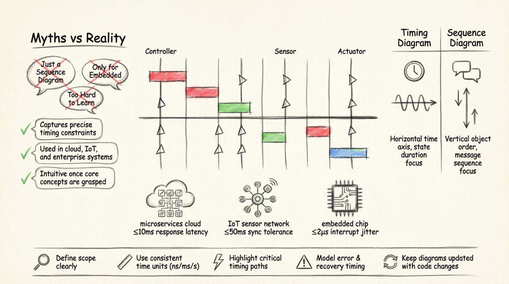
⚠️ Common Myths vs. Reality
There is a significant amount of noise surrounding this diagram type. Many teams avoid using it because they believe it is too difficult or unnecessary. Let us examine the most prevalent myths and the factual reality behind them.
| Myth | Reality |
|---|---|
| Myth 1: It is just a Sequence Diagram with time. | Reality: Sequence diagrams show message order. Timing diagrams show duration and state changes over a specific time window. |
| Myth 2: It is only for embedded systems. | Reality: While common in hardware, it applies to any system with latency constraints, including web services and databases. |
| Myth 3: It is too hard to read. | Reality: When structured correctly, it is the most precise way to communicate temporal logic. |
| Myth 4: It cannot handle parallel processes. | Reality: Multiple lifelines allow for the visualization of concurrent operations and synchronization points. |
🛠️ Core Components and Notation
To utilize this modeling technique effectively, one must understand the standard notation. Precision is key. Ambiguity in notation leads to ambiguity in implementation.
1. Lifelines
A lifeline represents an instance of a classifier. In a timing diagram, it is a vertical dashed line. It serves as the anchor for time-dependent information. Each lifeline corresponds to a specific component or object in the system.
2. State Changes
State changes are depicted as vertical bars on the lifeline. The height of the bar represents the duration the object is in a specific state. For instance, a red bar might indicate a “Processing” state, while a green bar indicates “Idle”. This visual cue helps stakeholders understand resource utilization over time.
3. Signal Events
Signals are represented by small triangles or circles on the lifeline. They indicate the arrival or transmission of a message. The position along the time axis determines when the event occurs. This is crucial for defining response times.
4. Focus of Control
Similar to sequence diagrams, a focus of control (or activation bar) can be used. It shows when an object is actively performing an operation. In timing diagrams, this is often combined with state information to show how long an operation takes to complete.
⏱️ Timing Diagram vs. Sequence Diagram
Confusion often arises between these two interaction diagrams. Both describe interactions between objects, but their purposes differ significantly. Choosing the wrong one can lead to miscommunication during the design phase.
| Feature | Timing Diagram | Sequence Diagram |
|---|---|---|
| Primary Focus | Time constraints and duration. | Order of messages and interactions. |
| Time Axis | Explicit horizontal time scale. | Implicit, vertical flow of time. |
| State Visibility | High visibility of state duration. | Low visibility of state duration. |
| Best Use Case | Real-time systems, performance modeling. | Logic flow, API contracts. |
| Complexity | Higher, due to temporal precision. | Lower, focuses on logical flow. |
When designing a system, it is often beneficial to use both. The sequence diagram establishes the logical flow of data. The timing diagram validates that this flow meets performance requirements. They complement each other rather than compete.
🏗️ Application in Modern Architecture
Modern software architecture has shifted towards microservices, distributed systems, and IoT. These environments introduce new challenges regarding latency and synchronization. The timing diagram remains relevant in these contexts.
1. Microservices and API Latency
In a distributed system, a single user request may trigger multiple service calls. Understanding the timing of these calls is vital for user experience. If the authentication service takes 200ms and the database query takes 500ms, the total response time is predictable. A timing diagram maps these intervals. It helps architects determine if a service needs optimization or caching.
2. IoT and Sensor Fusion
Internet of Things devices often need to synchronize data from multiple sensors. If a temperature sensor and a humidity sensor do not report within a specific window, the data becomes invalid. Timing diagrams model these synchronization points. They ensure that the system waits for all required data before processing.
3. Real-Time Operating Systems
Embedded systems often run on real-time operating systems (RTOS). These systems have hard deadlines. Missing a deadline can result in system failure. Timing diagrams are the standard tool for verifying these deadlines. They prove that the scheduler will meet all task requirements under worst-case scenarios.
📉 Common Mistakes to Avoid
Even experienced modelers make errors. These mistakes reduce the clarity of the diagram and lead to implementation bugs. Here are the most frequent pitfalls.
- Ignoring Time Scales: Failing to label the time axis makes the diagram useless. Always define the unit of measurement (milliseconds, seconds, clock cycles).
- Overloading Lifelines: Putting too many objects on one diagram makes it unreadable. Split complex interactions into multiple diagrams.
- Neglecting Deadlines: A timing diagram is incomplete without showing the constraints. Mark deadlines explicitly to highlight critical paths.
- Inconsistent Notation: Mixing symbols from different diagram types causes confusion. Stick to the standard UML notation for consistency.
- Assuming Parallelism: Just because lifelines are side-by-side does not mean they are always active simultaneously. Clearly mark active periods.
✅ Best Practices for Modeling
To ensure your diagrams provide value, follow these guidelines. Consistency and clarity are the goals of documentation.
1. Define the Scope Clearly
Start with a specific scenario. Do not try to model the entire system in one diagram. Break down complex workflows into manageable chunks. A single diagram should cover one logical sequence of events.
2. Use Consistent Time Units
Do not mix seconds and milliseconds within the same diagram unless explicitly noted. This prevents calculation errors during implementation. Choose a unit that matches the precision of your system.
3. Highlight Critical Paths
Use bold lines or specific colors to indicate critical timing paths. These are the sequences that determine the overall performance of the system. Making them stand out helps the team prioritize optimization efforts.
4. Include Error Handling
Timing is not just about success paths. It is also about failures. Show what happens if a timeout occurs. Does the system retry? Does it fail over? Modeling these scenarios ensures robustness.
5. Keep it Up to Date
Architecture evolves. If the code changes, the diagram must change. Outdated diagrams are worse than no diagrams. They create a false sense of security. Regularly review and update the models as the system matures.
🚀 The Value of Precision
Software development is increasingly becoming a race against time. Users expect instant responses. Systems must handle massive loads without dropping packets. In this environment, vague descriptions are insufficient. Precision is required.
The UML Timing Diagram provides that precision. It forces the team to think about the “when” as much as the “what”. This shift in perspective leads to better performance and more reliable systems. It bridges the gap between abstract design and concrete implementation.
By separating confusion from clarity, teams can build software that not only works but works on time. This is the true power of the timing diagram. It transforms abstract time into a tangible design constraint.
🔍 Summary of Key Takeaways
- Visualizing Time: The diagram explicitly models the passage of time and duration of states.
- Distinction from Sequence: Focus on duration rather than just message order.
- Modern Relevance: Essential for microservices, IoT, and real-time systems.
- Avoiding Pitfalls: Maintain clear time scales and limit scope per diagram.
- Documentation Value: Serves as a contract for performance requirements.
As you continue your work in software architecture, consider where time is a constraint. If it is, a timing diagram may be the most effective tool to communicate your design. It brings clarity to the chaos of temporal dependencies. Use it to guide your team toward reliable, high-performance solutions.